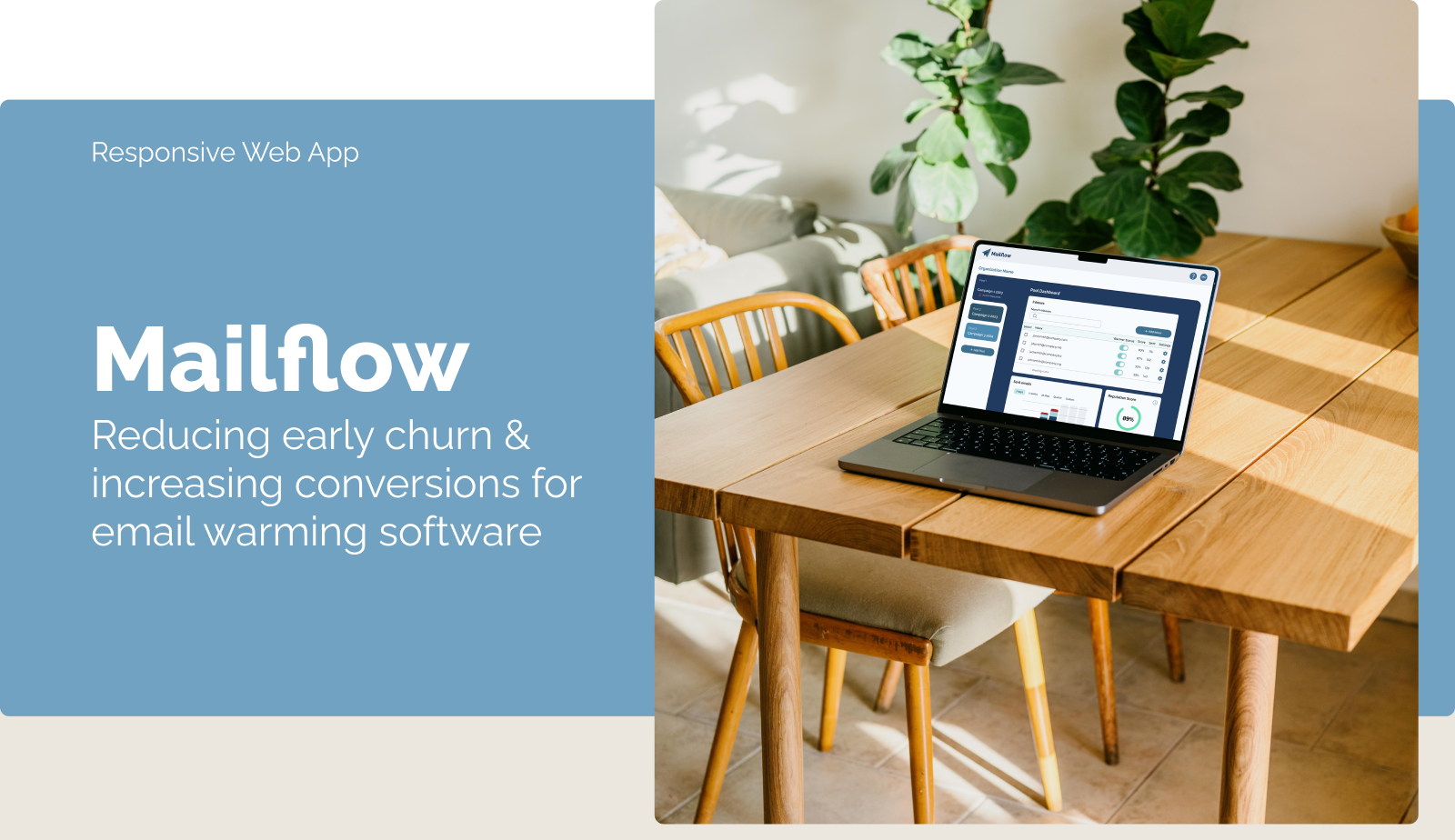
Lifelong (Learner)
Native App
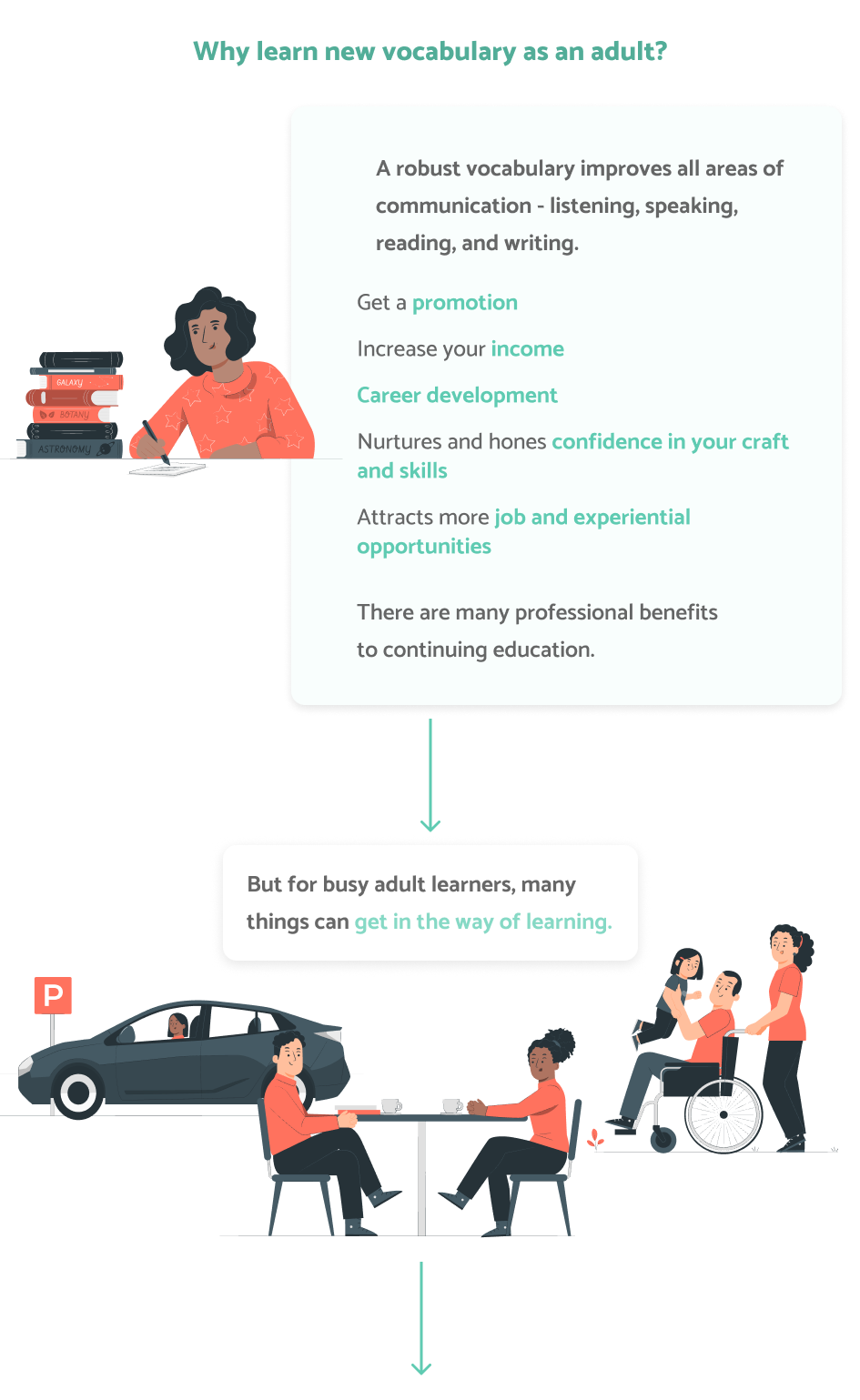
Adults have a number of motivations for learning new vocabulary, including vocational trainings/certifications or personal development. However, they encounter many challenges that may prevent them from learning terms in traditional manners.

I designed Lifelong (Learner), a mobile app that empowers adult learners to practice and learn new vocabulary in a way that fits into their busy schedules. It presents the user with vocabulary based on their interests and allows them to seamlessly add novel terms for fast and easy practice sessions. Lifelong was created as part of my CareerFoundry UX Design course to explore new tools, methodologies, and skills.
First, I spent time exploring the market to examine how existing vocabulary learning solutions meet the needs of adult learners, where they fall short, and where they succeed. I drew inspiration from both the strengths and opportunities of the analyzed apps.
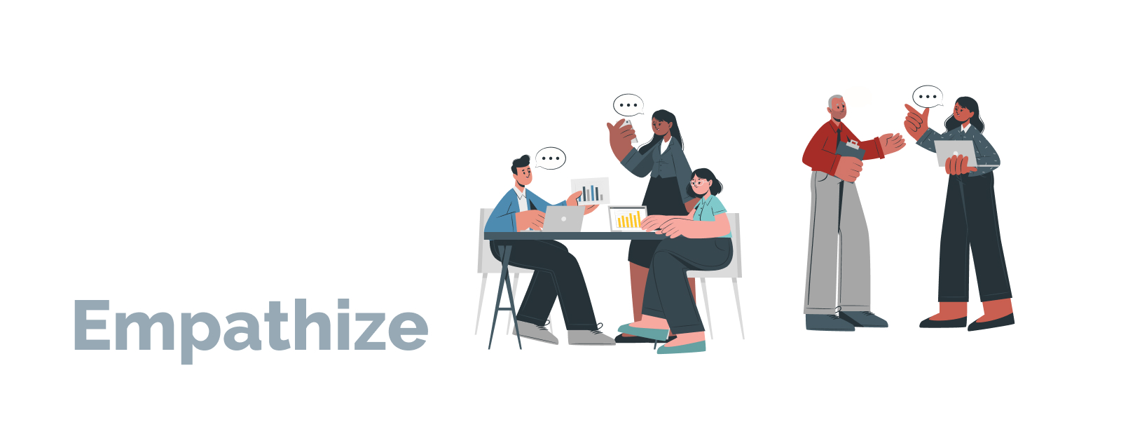
Before diving into solutions, I wanted to better understand adults that endeavor to learn new vocabulary to better identify gaps in the current market and user needs that I could address. I interviewed four adult vocabulary learners with the following goals in mind:
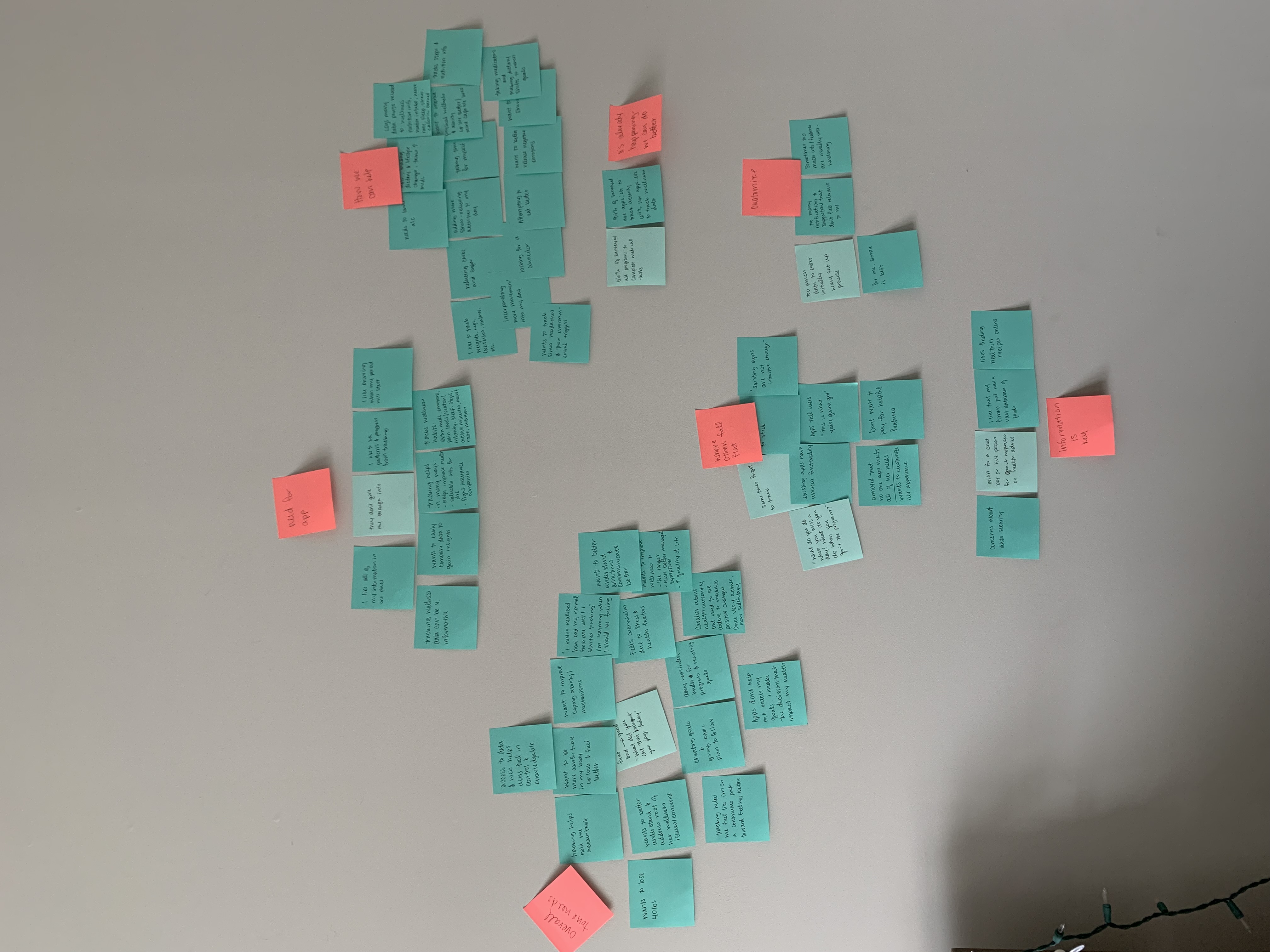
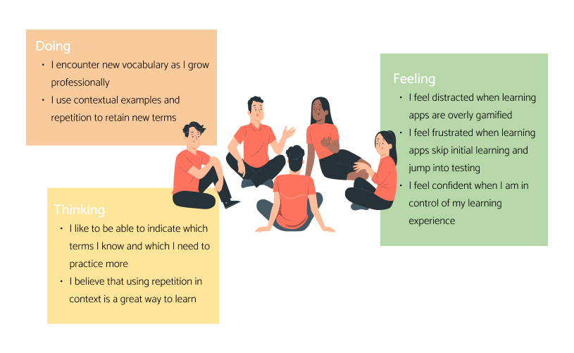
Based on user responses, I created an empathy map in order to succinctly understand what they do, think, and say about learning vocabulary and related apps. Here's what I found:
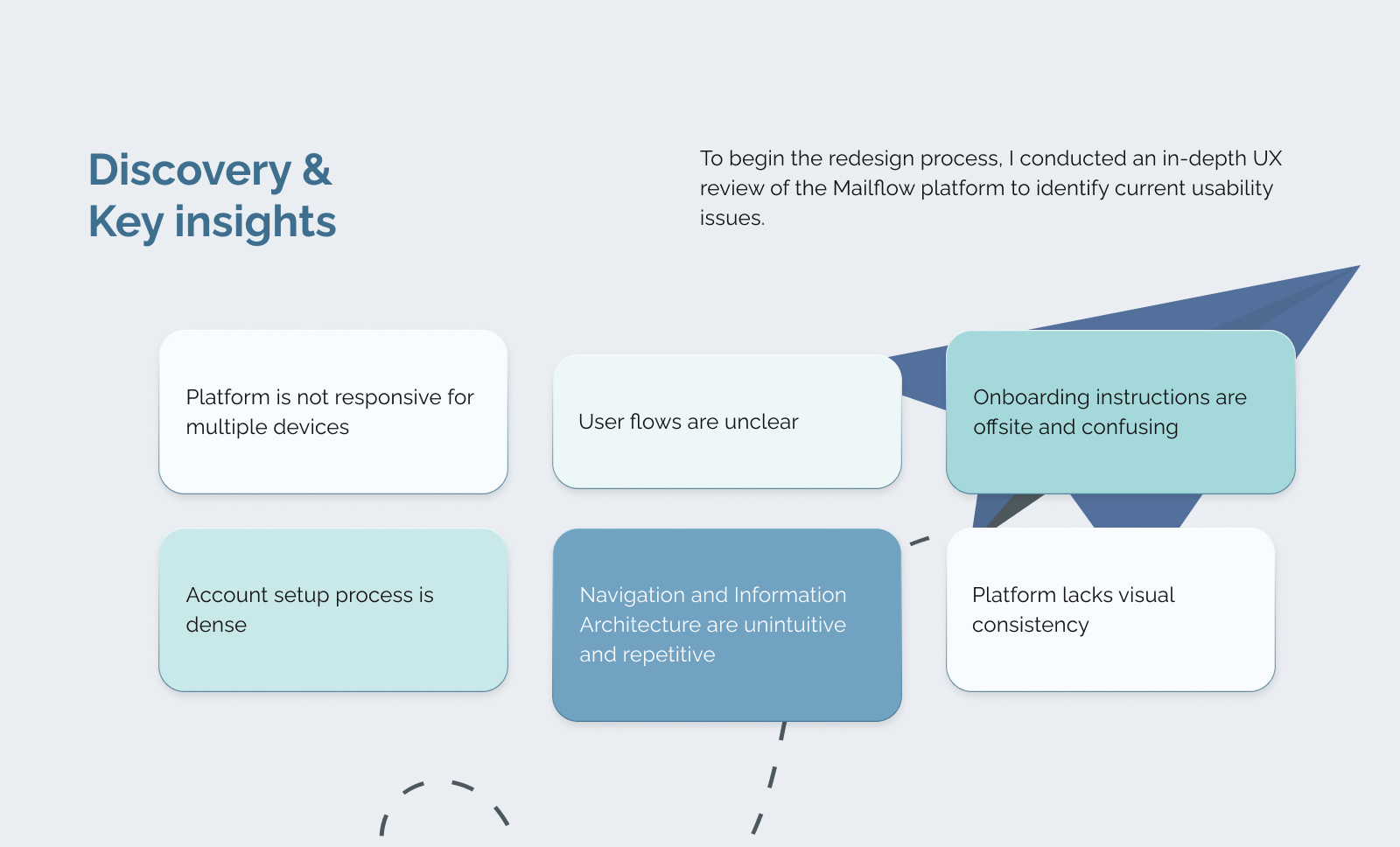
Due to frustrations with vocabulary learning applications that are currently available, many adult learners choose not use them.

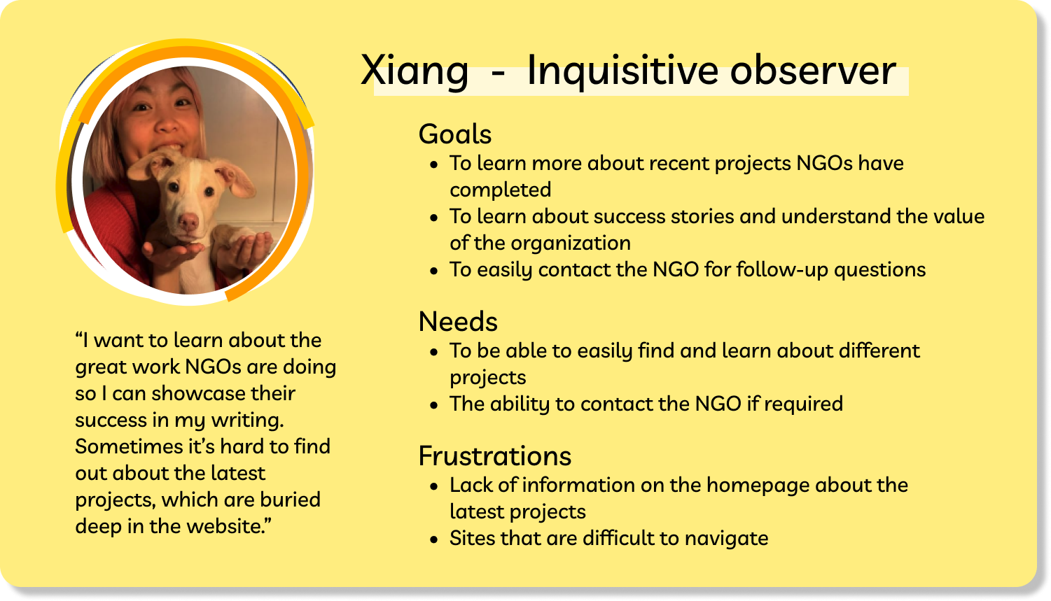
I synthesized the results and insights of my user interviews into the following proto-persona, Clara. Clara humanized the goals of the application, guided design decisions, and acted as a litmus test for feature inclusion and success.


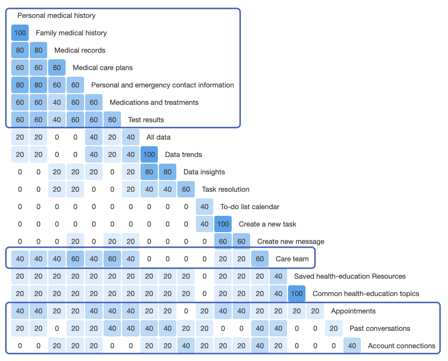
With Clara in mind, I brainstormed solution ideas to meet the needs that emerged from my research.
I considered the applicability and use of each of my proposed solutions. For example, including a language learning feature could have met the needs of some adult learners. However, this need was not greatly represented in my interviewed users.
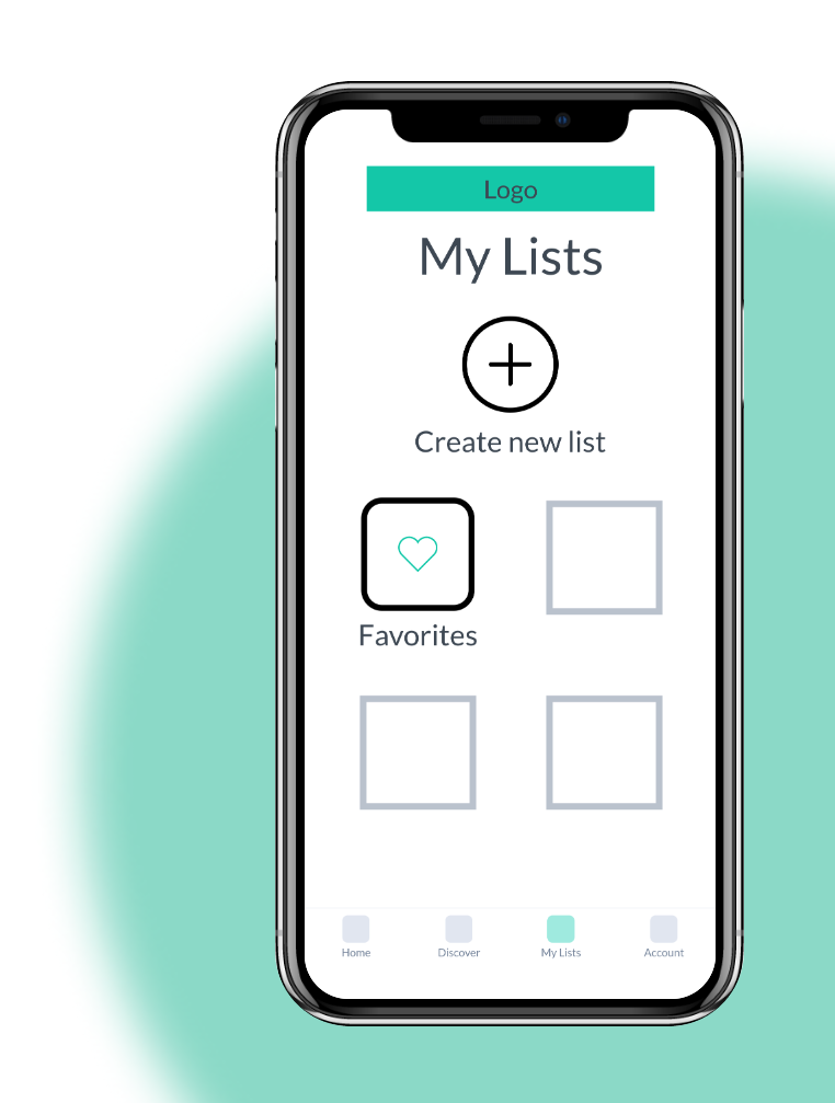
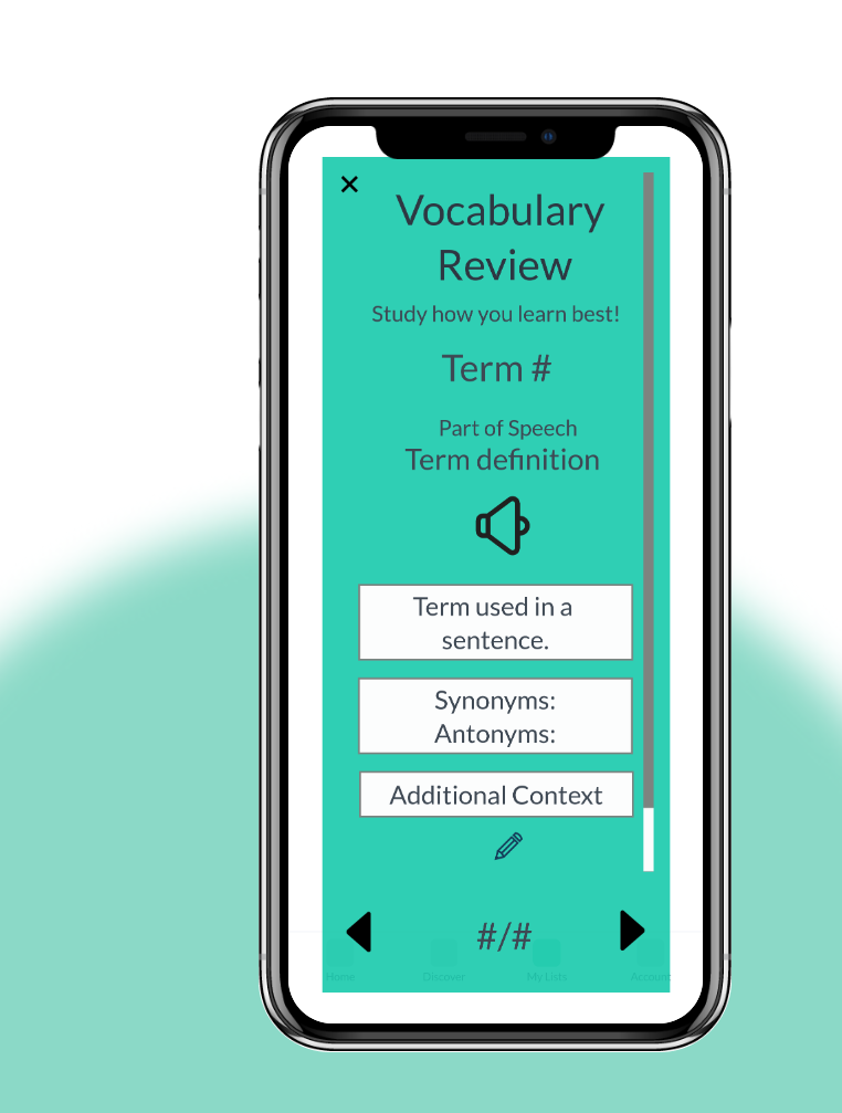
I settled on the following core functionalities:
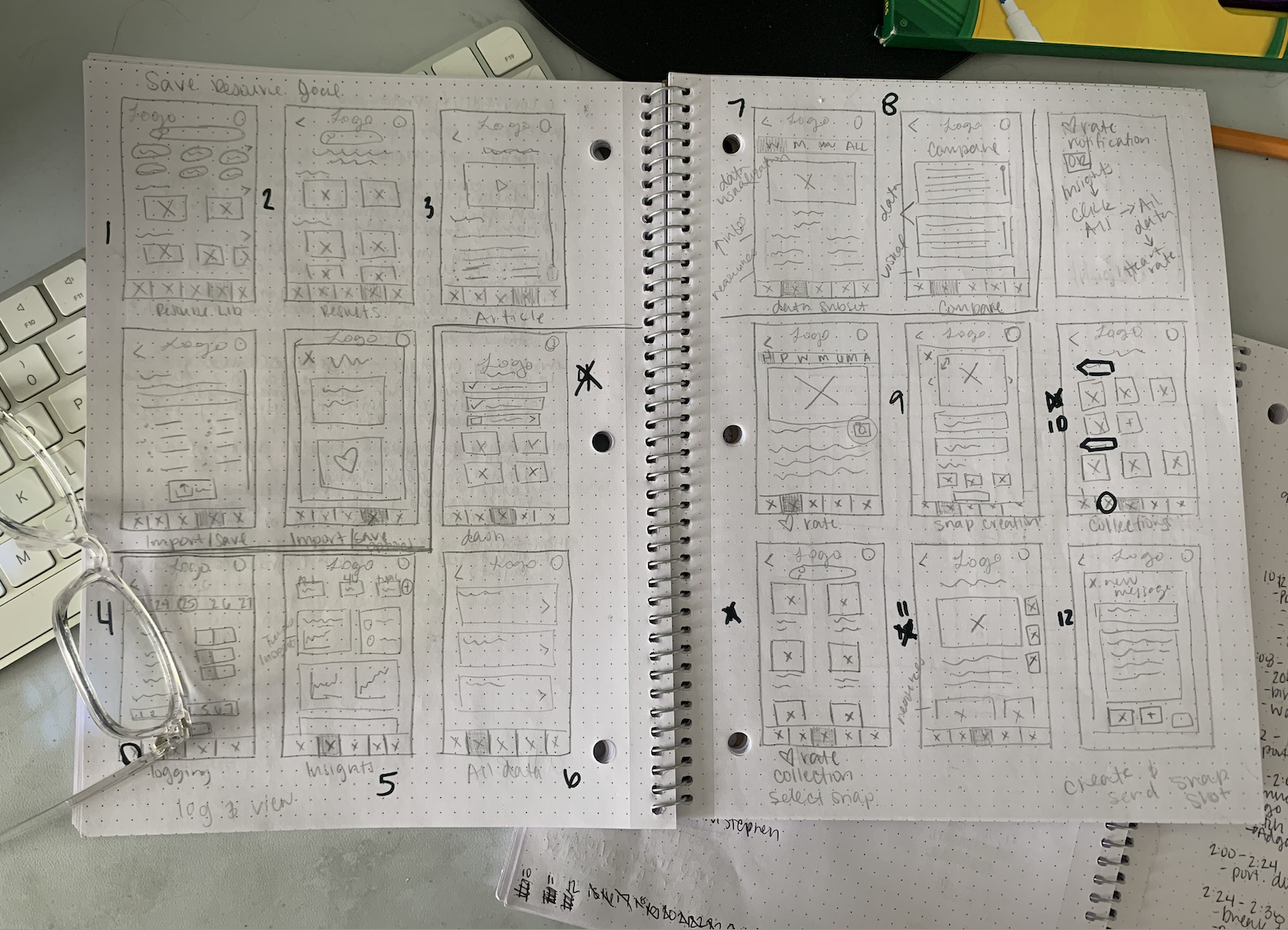
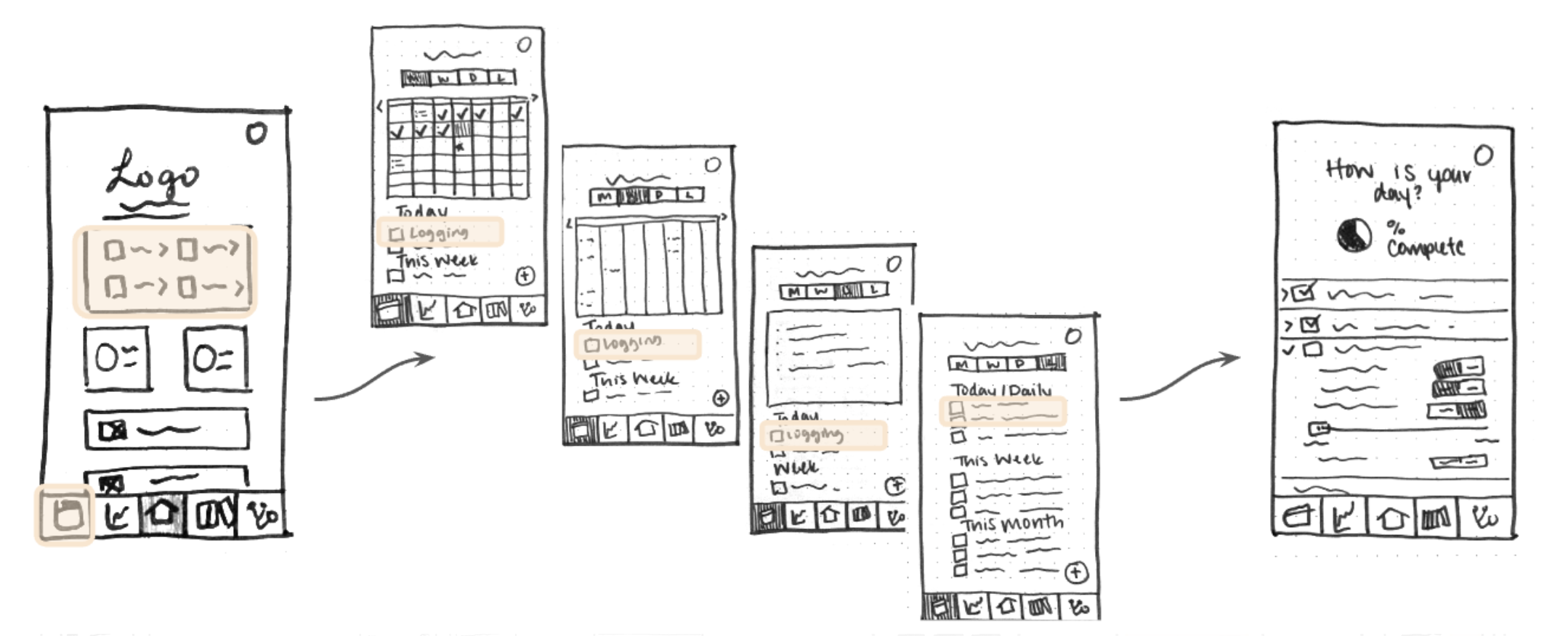
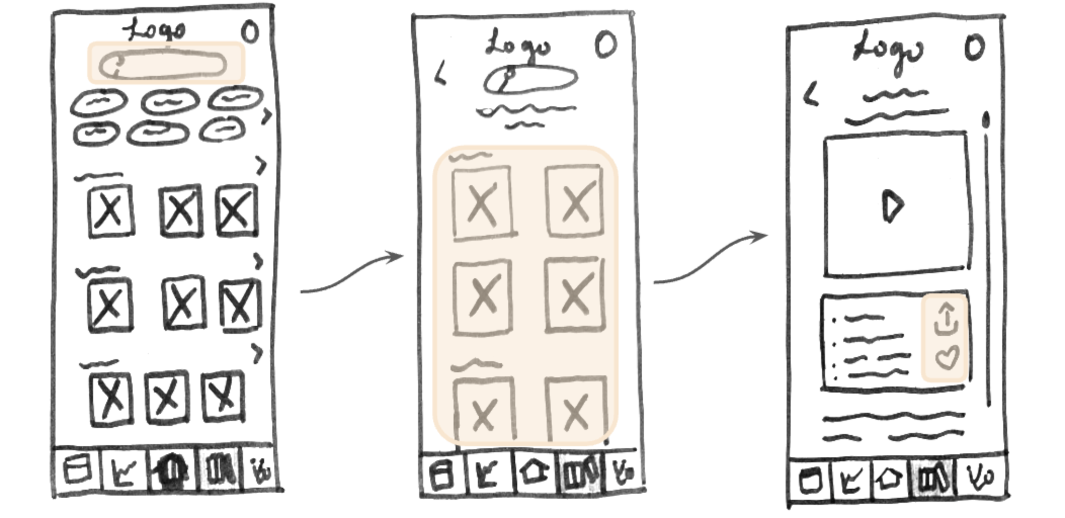
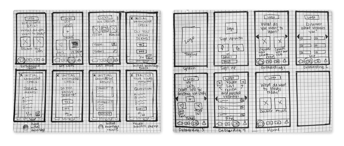
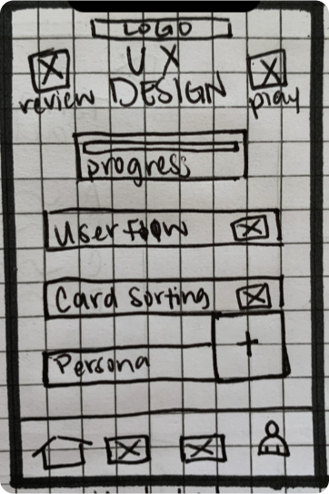
Based on insights gathered from my user testing sessions and error prioritization (thanks Nielsen), I used the Marvel app to create a mid-fidelity prototype that better addressed the needs of my prospective audience.
This project’s requirements ended with testing a mid-fidelity prototype. In order to get a better idea of the effectiveness of Lifelong, higher fidelity prototype iterations would need to be tested with users from the prospective audience. Testing a UI and application voice that appeals to this audience would provide a more realistic environment and insights into app usability.
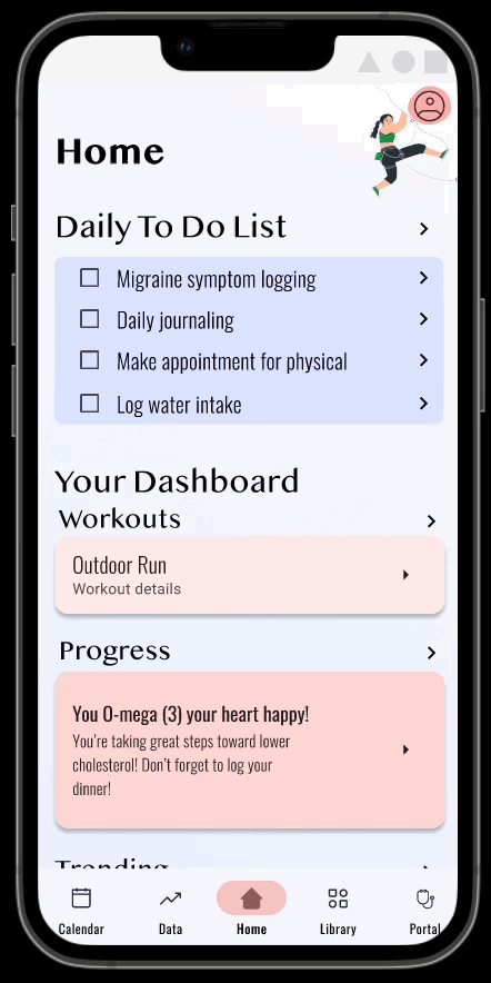
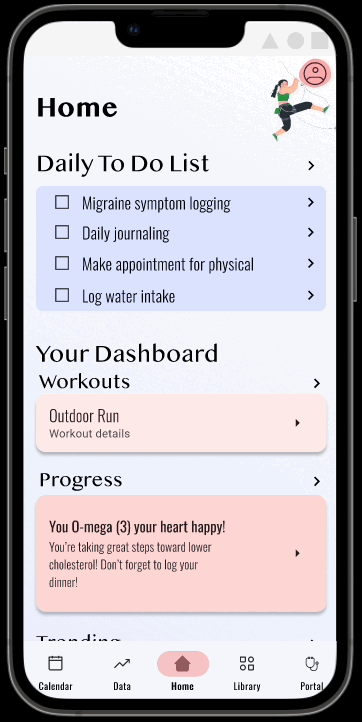
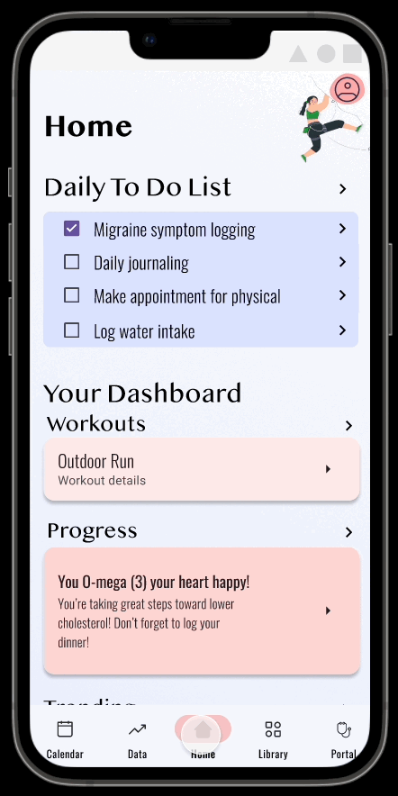
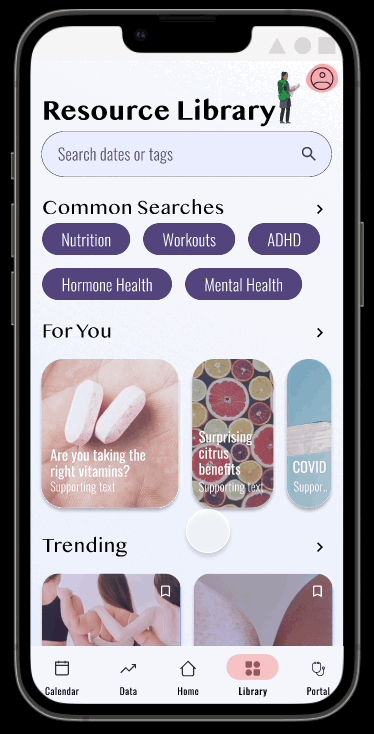
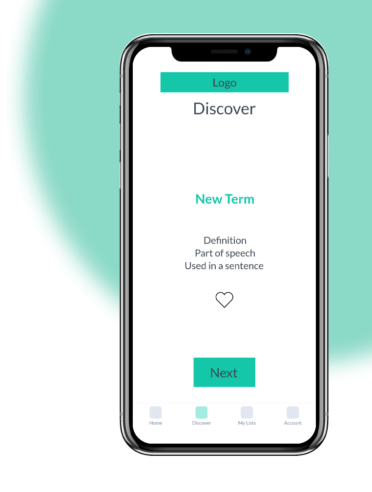
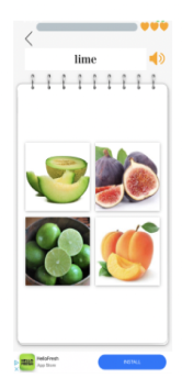
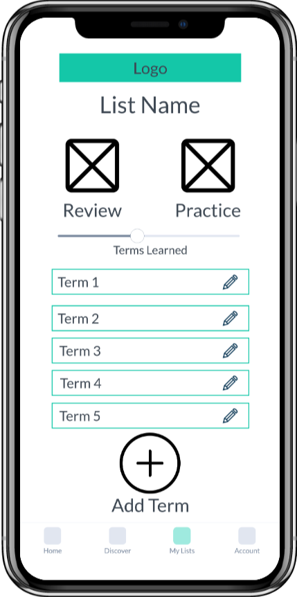
Lifelong allows busy adults to interact with new vocabulary in a number of ways, on their terms (pun intended). They can learn new terms faster than ever by adding terms from a definition source. They can save app-presented terms for later practice. Further, they can study specific term lists at preferred times with the help of quick-launching and sophisticated, repetitive practice.
To build a successful and useful product, designers must balance the needs and goals of the business (stakeholder) the users. The business goal of Lifelong was to see widespread adoption of a vocabulary learning platform. I used generative user research to understand the needs of my prospective audience. Through the UCD process, I enjoyed creating an engaging possible solution to the challenges presented.
Looking back at my first project in the UX field, I can confidently say that user-centered design skills are a superpower. Putting the user front and center is the key to success. By diving into user research, conducting interviews and usability tests, I gained invaluable and unforeseen insights into the target audience's needs and pain points. My user persona and user flows guided my design decisions from there. Embracing an iterative approach and continuously seeking user feedback would allow me to create an intuitive and user-friendly product on its way to hitting the mark. These user-centered design skills guide my work and give it a touch of magic.
Adults have a number of motivations for learning new vocabulary, including vocational trainings/certifications or personal development. However, they encounter many challenges that may prevent them from learning terms in traditional manners.
I designed Lifelong (Learner), a mobile app that empowers adult learners to practice and learn new vocabulary in a way that fits into their busy schedules. It presents the user with vocabulary based on their interests and allows them to seamlessly add novel terms for fast and easy practice sessions. Lifelong was created as part of my CareerFoundry UX Design course to explore new tools, methodologies, and skills.
First, I spent time exploring the market to examine how existing vocabulary learning solutions meet the needs of adult learners, where they fall short, and where they succeed. I drew inspiration from both the strengths and opportunities of the analyzed apps.


Before diving into solutions, I wanted to better understand adults that endeavor to learn new vocabulary to better identify gaps in the current market and user needs that I could address. I interviewed four adult vocabulary learners with the following goals in mind:
Based on user responses, I created an empathy map in order to succinctly understand what they do, think, and say about learning vocabulary and related apps. Here's what I found:
Due to frustrations with vocabulary learning applications that are currently available, many adult learners choose not use them.
I synthesized the results and insights of my user interviews into the following proto-persona, Clara. Clara humanized the goals of the application, guided design decisions, and acted as a litmus test for feature inclusion and success.
With Clara in mind, I brainstormed solution ideas to meet the needs that emerged from my research.
I considered the applicability and use of each of my proposed solutions. For example, including a language learning feature could have met the needs of some adult learners. However, this need was not greatly represented in my interviewed users.
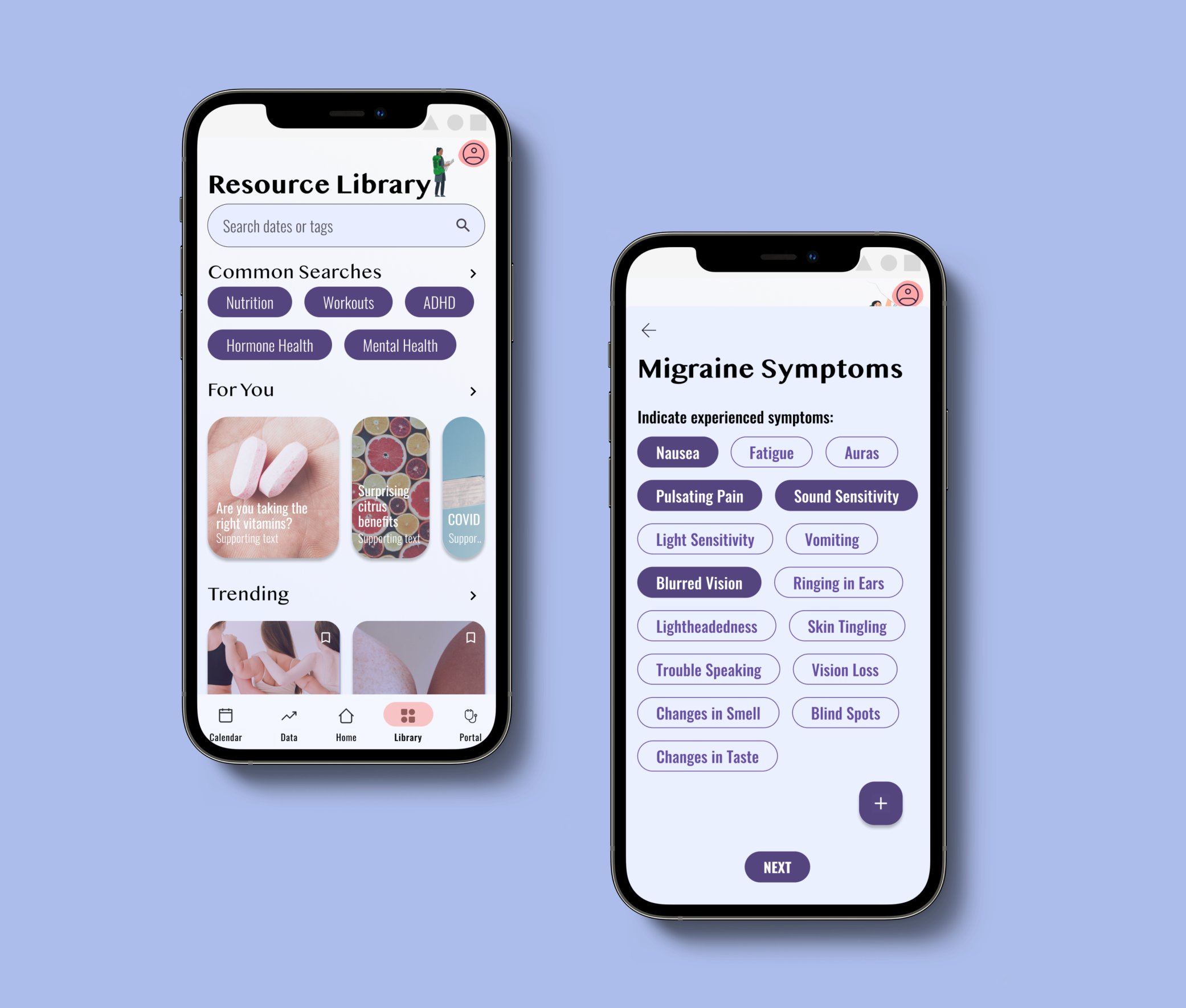
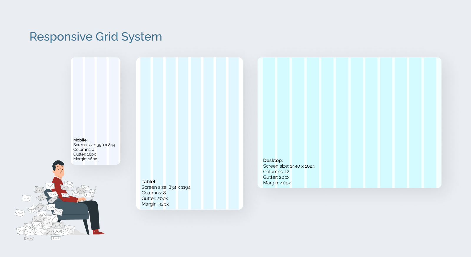
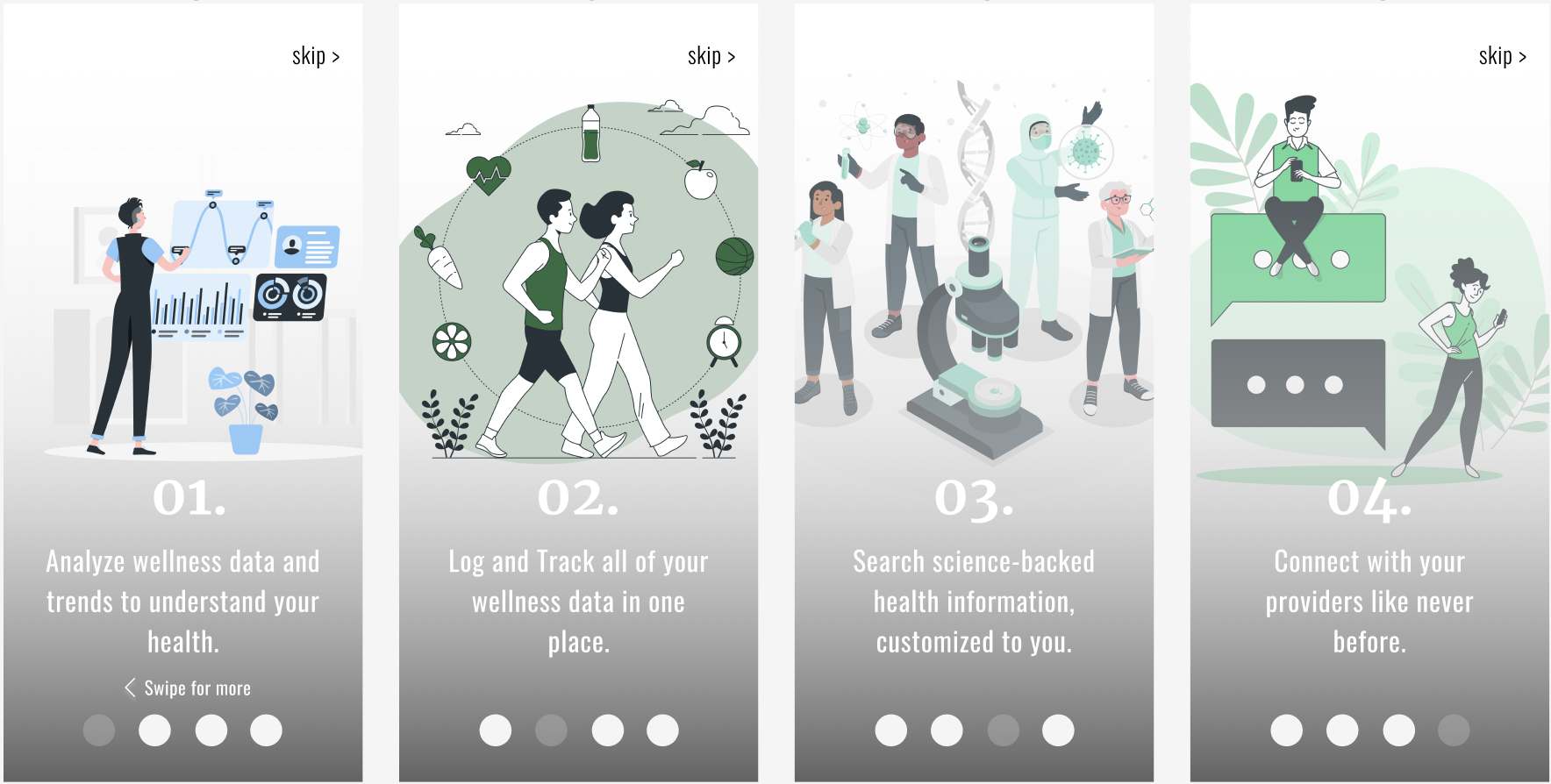
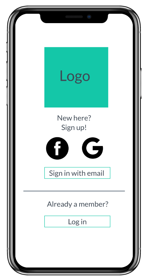
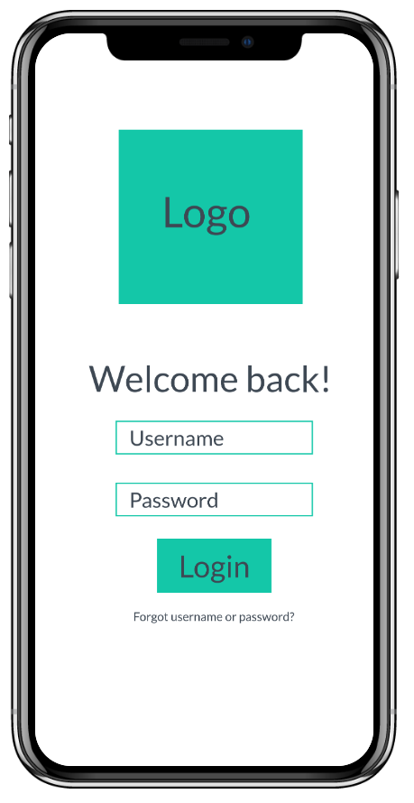
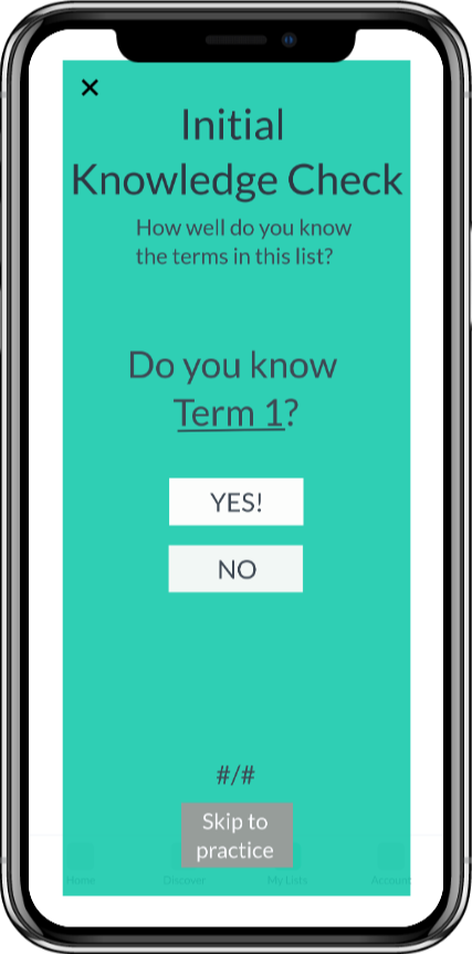
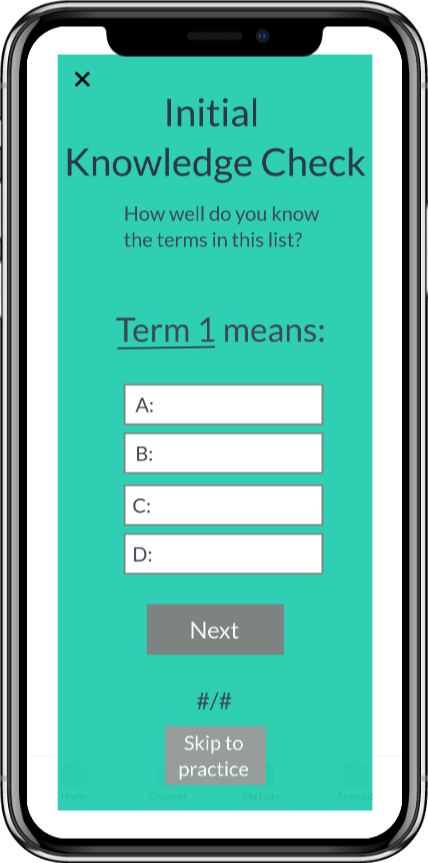
I settled on the following core functionalities:


.png)
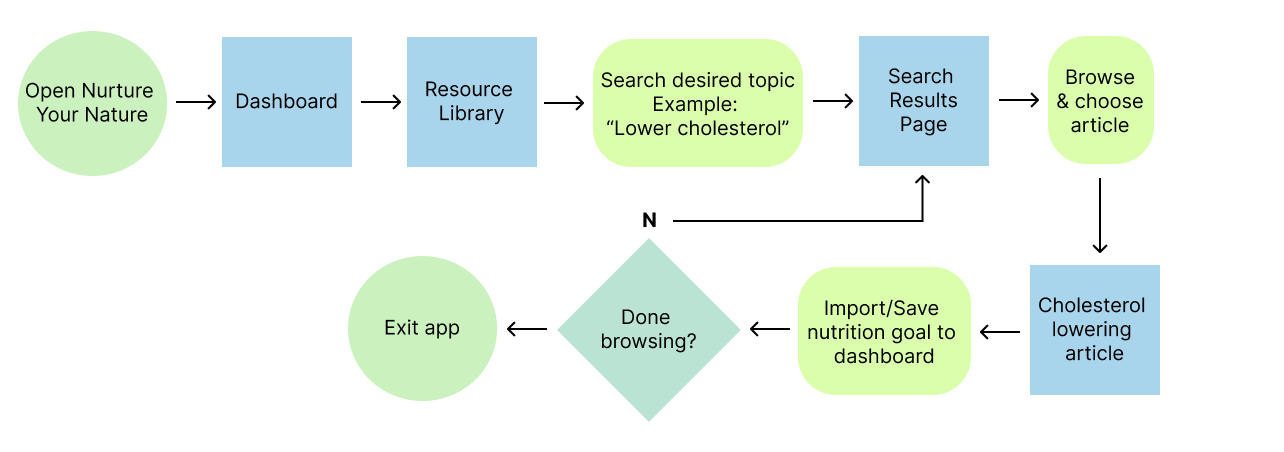

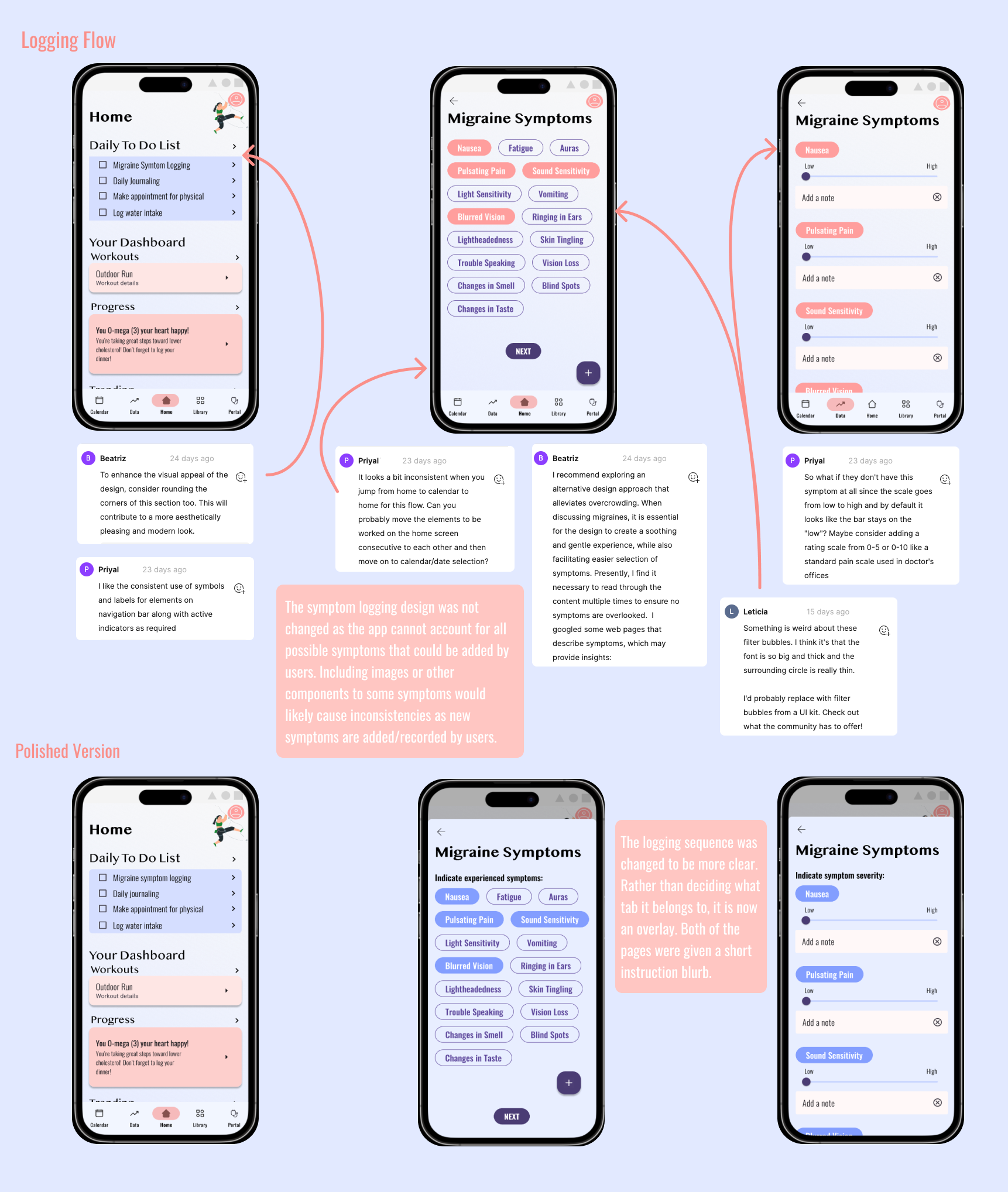
To test the success of the design, I conducted three usability testing sessions with participants from my prospective audience. Here is an overview of the process I took:
I aimed to quantitatively and qualitatively measure the success of my design based on the following focuses:
During each session, I requested that the user think aloud as they attempted to create an account, create a new vocabulary list, and add and practice new terms. I watched, listened, took notes, and gathered feedback. Additionally, I used Nielsen's error severity rating scale to prioritize actions taken in my iteration process.
 All design & feedback considerations
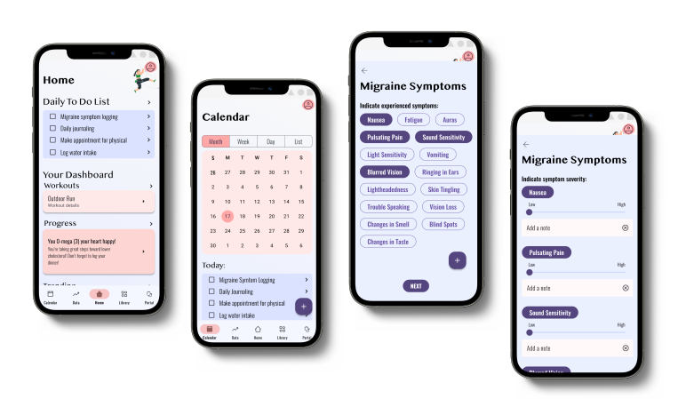
This project’s requirements ended with testing a mid-fidelity prototype. In order to get a better idea of the effectiveness of Lifelong, higher fidelity prototype iterations would need to be tested with users from the prospective audience. Testing a UI and application voice that appeals to this audience would provide a more realistic environment and insights into app usability.
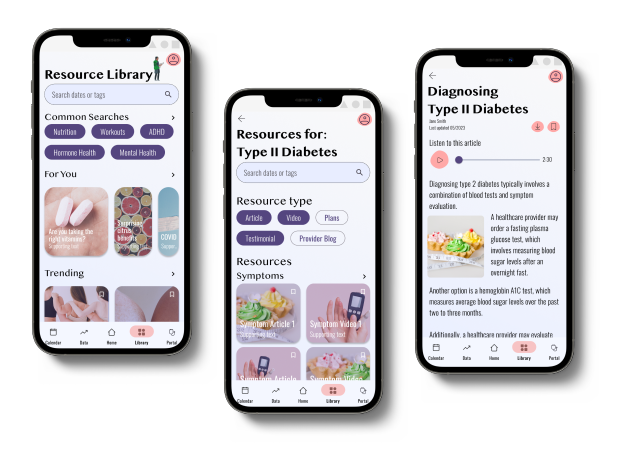
Lifelong allows busy adults to interact with new vocabulary in a number of ways, on their terms (pun intended). They can learn new terms faster than ever by adding terms from a definition source. They can save app-presented terms for later practice. Further, they can study specific term lists at preferred times with the help of quick-launching and sophisticated, repetitive practice.
To build a successful and useful product, designers must balance the needs and goals of the business (stakeholder) the users. The business goal of Lifelong was to see widespread adoption of a vocabulary learning platform. I used generative user research to understand the needs of my prospective audience. Through the UCD process, I enjoyed creating an engaging possible solution to the challenges presented.
Looking back at my first project in the UX field, I can confidently say that user-centered design skills are a superpower. Putting the user front and center is the key to success. By diving into user research, conducting interviews and usability tests, I gained invaluable and unforeseen insights into the target audience's needs and pain points. My user persona and user flows guided my design decisions from there. Embracing an iterative approach and continuously seeking user feedback would allow me to create an intuitive and user-friendly product on its way to hitting the mark. These user-centered design skills guide my work and give it a touch of magic.
Adults have a number of motivations for learning new vocabulary, including vocational trainings/certifications or personal development. However, they encounter many challenges that may prevent them from learning terms in traditional manners.
I designed Lifelong (Learner), a mobile app that empowers adult learners to practice and learn new vocabulary in a way that fits into their busy schedules. It presents the user with vocabulary based on their interests and allows them to seamlessly add novel terms for fast and easy practice sessions. Lifelong was created as part of my CareerFoundry UX Design course to explore new tools, methodologies, and skills.
First, I spent time exploring the market to examine how existing vocabulary learning solutions meet the needs of adult learners, where they fall short, and where they succeed. I drew inspiration from both the strengths and opportunities of the analyzed apps.


Before diving into solutions, I wanted to better understand adults that endeavor to learn new vocabulary to better identify gaps in the current market and user needs that I could address. I interviewed four adult vocabulary learners with the following goals in mind:
Based on user responses, I created an empathy map in order to succinctly understand what they do, think, and say about learning vocabulary and related apps. Here's what I found:
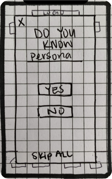
Due to frustrations with vocabulary learning applications that are currently available, many adult learners choose not use them.
 Interview script, notes, & summary
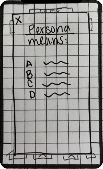
I synthesized the results and insights of my user interviews into the following proto-persona, Clara. Clara humanized the goals of the application, guided design decisions, and acted as a litmus test for feature inclusion and success.
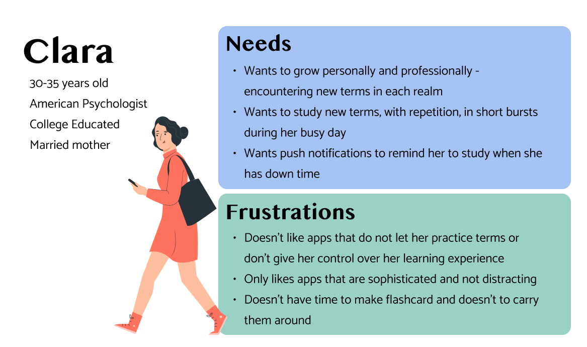 See full persona
With Clara in mind, I brainstormed solution ideas to meet the needs that emerged from my research.
I considered the applicability and use of each of my proposed solutions. For example, including a language learning feature could have met the needs of some adult learners. However, this need was not greatly represented in my interviewed users.
I settled on the following core functionalities:


.jpg)
To test the success of the design, I conducted three usability testing sessions with participants from my prospective audience. Here is an overview of the process I took:
I aimed to quantitatively and qualitatively measure the success of my design based on the following focuses:
During each session, I requested that the user think aloud as they attempted to create an account, create a new vocabulary list, and add and practice new terms. I watched, listened, took notes, and gathered feedback. Additionally, I used Nielsen's error severity rating scale to prioritize actions taken in my iteration process.

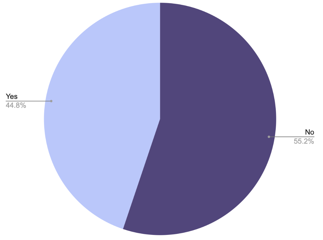
Overall, I was able to gather a lot of positive feedback on the prototype. Users expressed appreciation for the app's simplicity and onboarding process. Three out of Three users agree that the app's learnability was accessible and that they would be able to easily use the app on the next interaction.
A few commonalities emerged for improvement, also. From my observations, I ranked issues using Nielsen's Error Severity Rating Scale to guide my next steps.
For my next iteration of the application, I aimed to improve the usability, clarify navigation elements, and reduce confusion for users. I took a number of steps to do so:
This project’s requirements ended with testing a mid-fidelity prototype. In order to get a better idea of the effectiveness of Lifelong, higher fidelity prototype iterations would need to be tested with users from the prospective audience. Testing a UI and application voice that appeals to this audience would provide a more realistic environment and insights into app usability.
Lifelong allows busy adults to interact with new vocabulary in a number of ways, on their terms (pun intended). They can learn new terms faster than ever by adding terms from a definition source. They can save app-presented terms for later practice. Further, they can study specific term lists at preferred times with the help of quick-launching and sophisticated, repetitive practice.
To build a successful and useful product, designers must balance the needs and goals of the business (stakeholder) the users. The business goal of Lifelong was to see widespread adoption of a vocabulary learning platform. I used generative user research to understand the needs of my prospective audience. Through the UCD process, I enjoyed creating an engaging possible solution to the challenges presented.
Looking back at my first project in the UX field, I can confidently say that user-centered design skills are a superpower. Putting the user front and center is the key to success. By diving into user research, conducting interviews and usability tests, I gained invaluable and unforeseen insights into the target audience's needs and pain points. My user persona and user flows guided my design decisions from there. Embracing an iterative approach and continuously seeking user feedback would allow me to create an intuitive and user-friendly product on its way to hitting the mark. These user-centered design skills guide my work and give it a touch of magic.