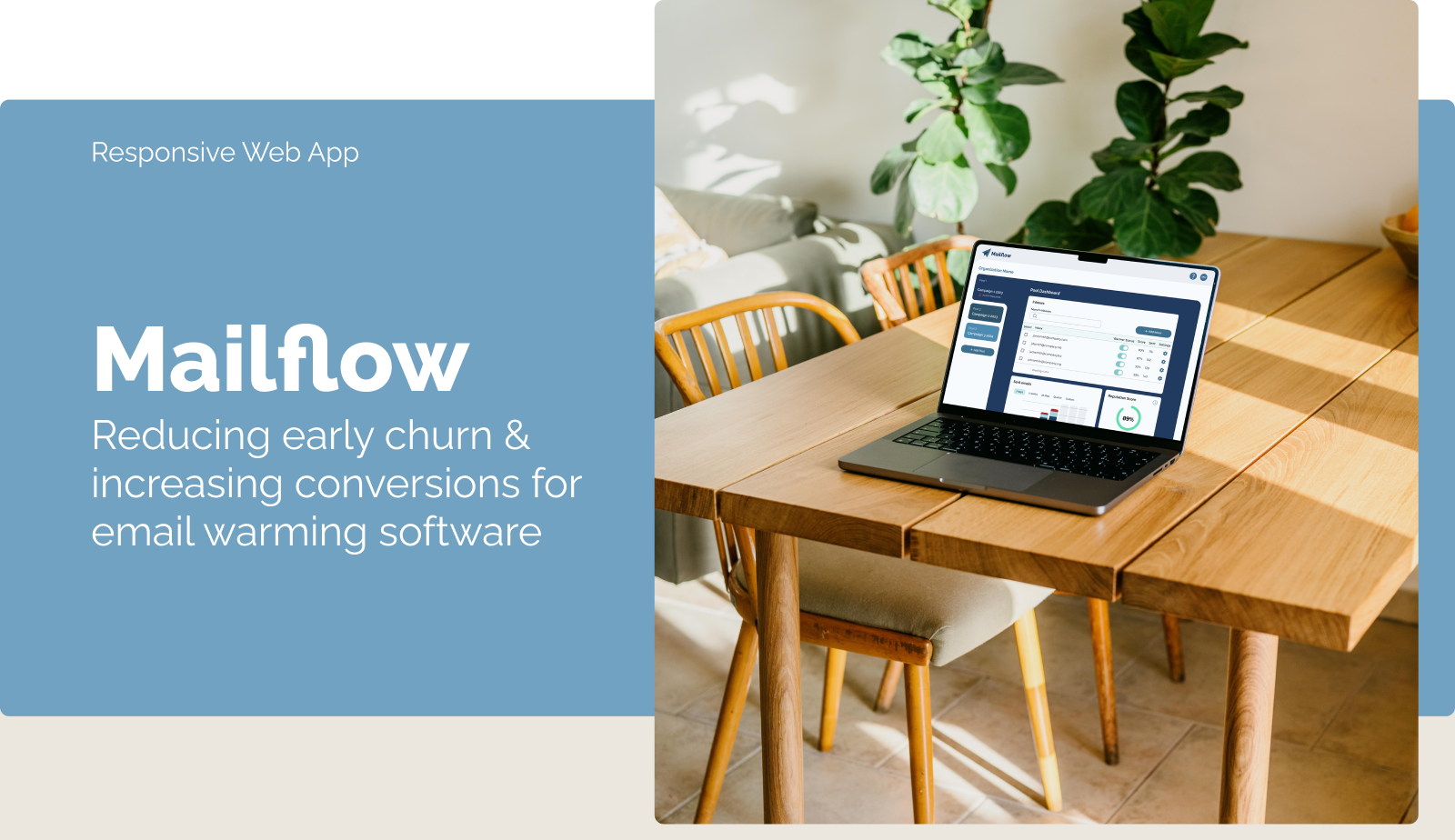
Right To Play
Redesign
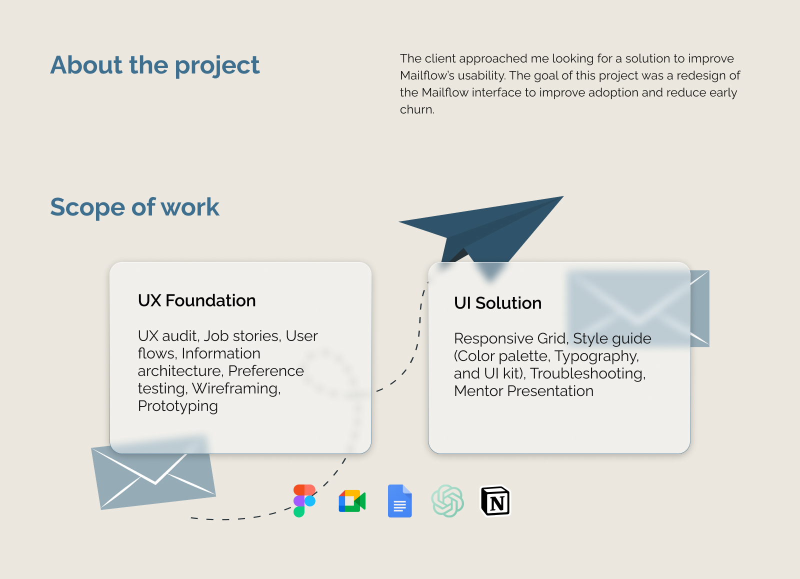
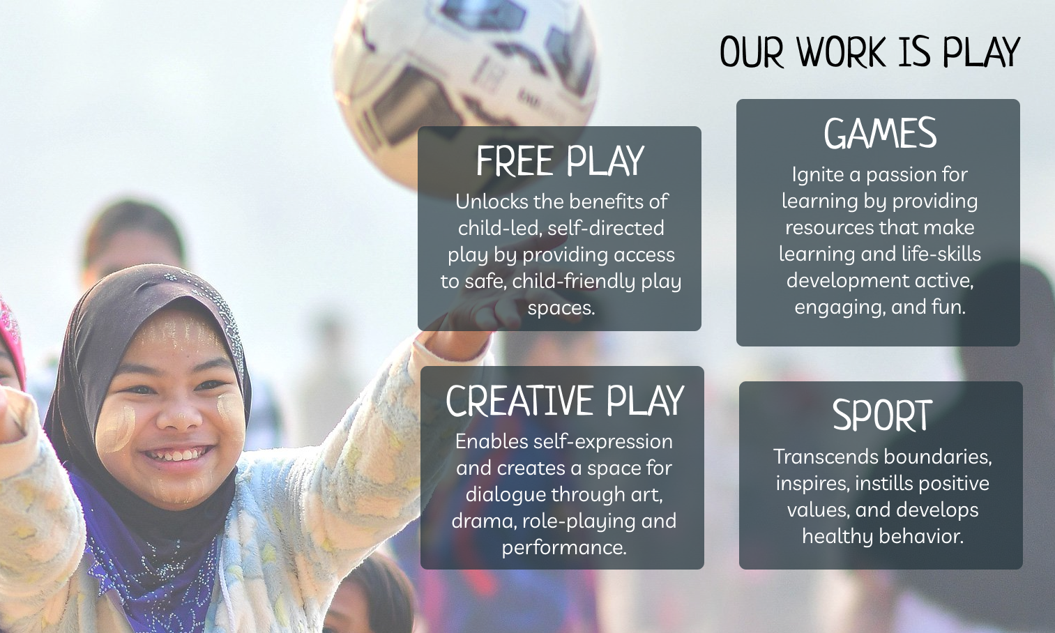
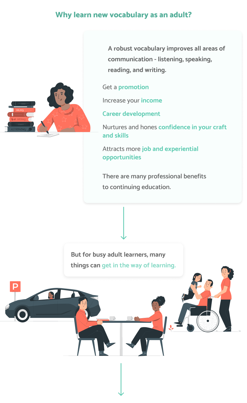
Right To Play is a nonprofit organization with a mission to protect, educate, and empower children to rise above adversity using the power of play. Their goal is to improve the lives of 100 million children around the world by 2030.
The have identified their homepage as needing improvement. The following stand between Right To Play and their goals:
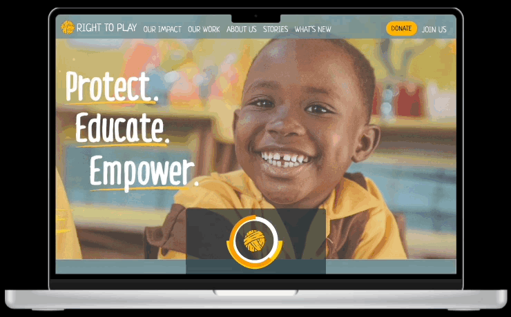
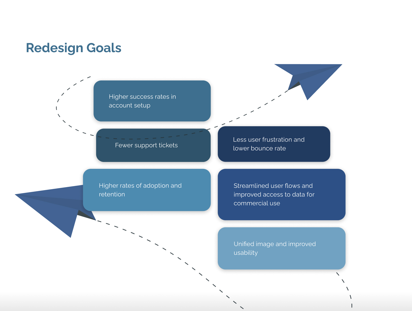
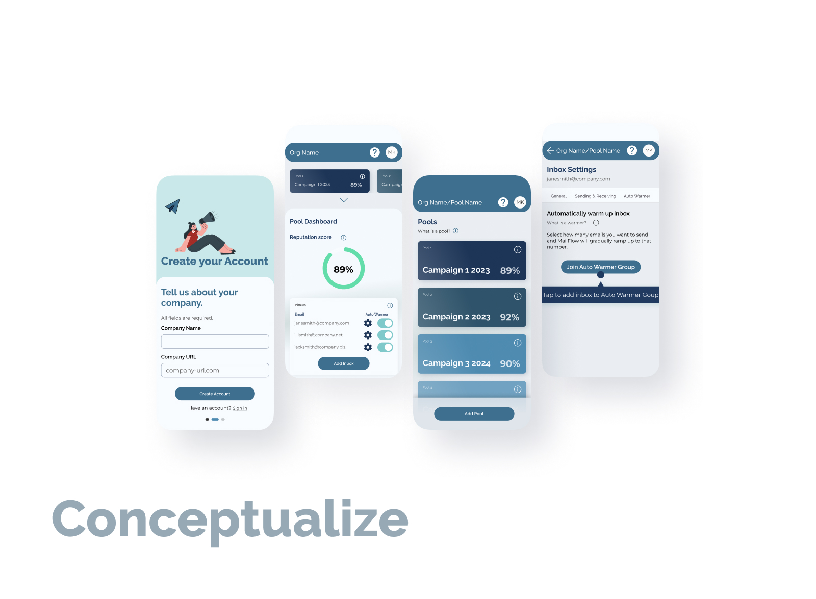
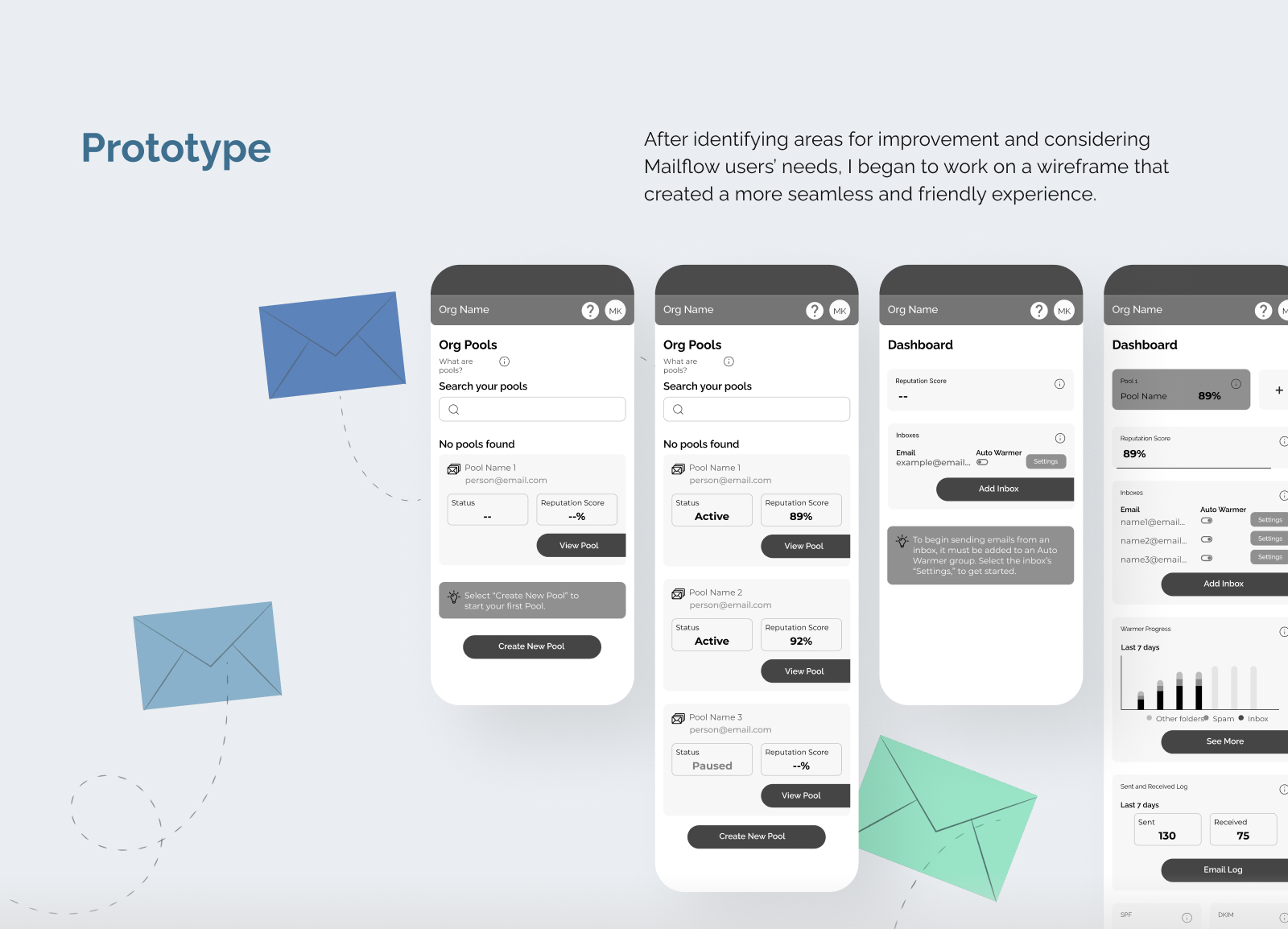
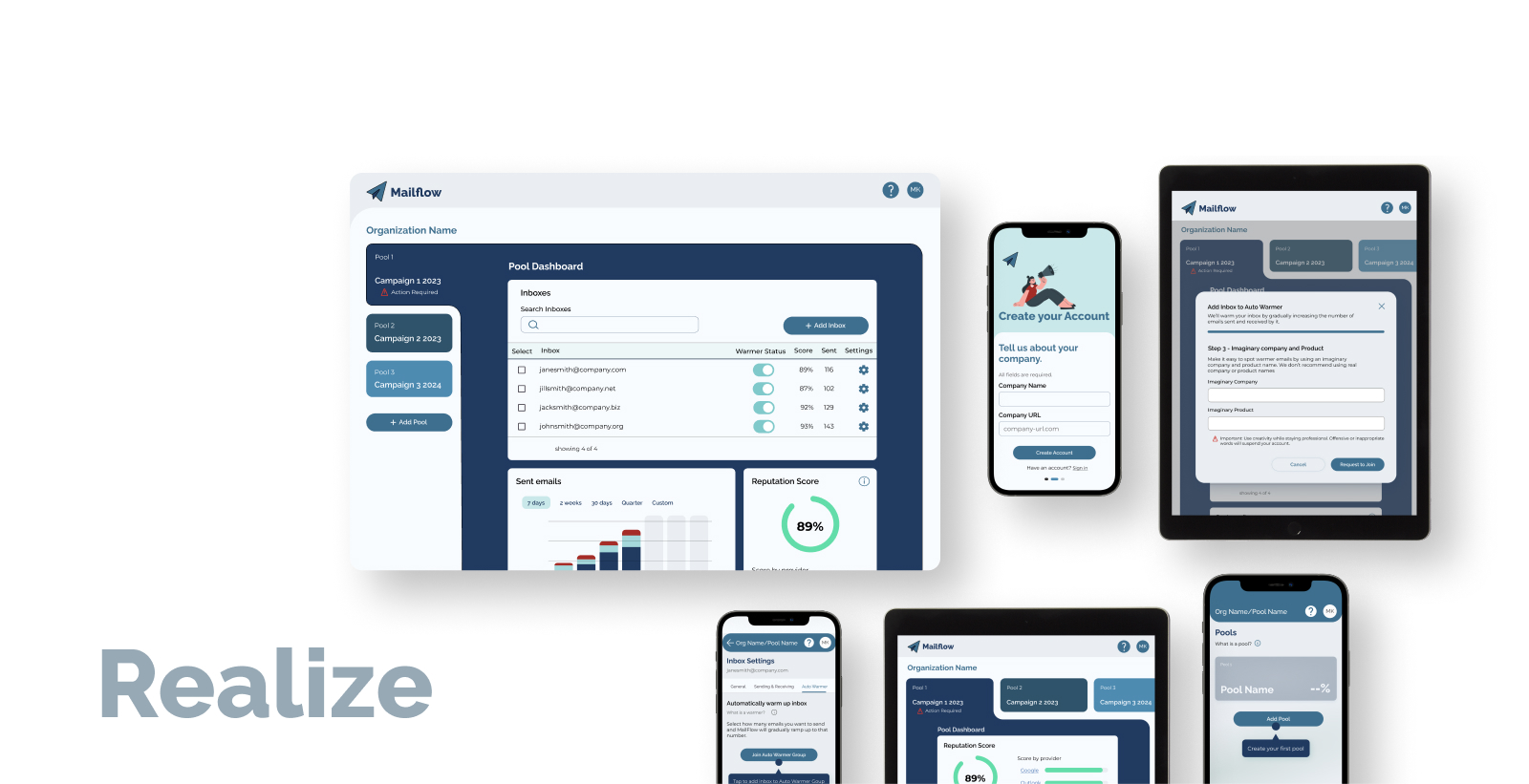
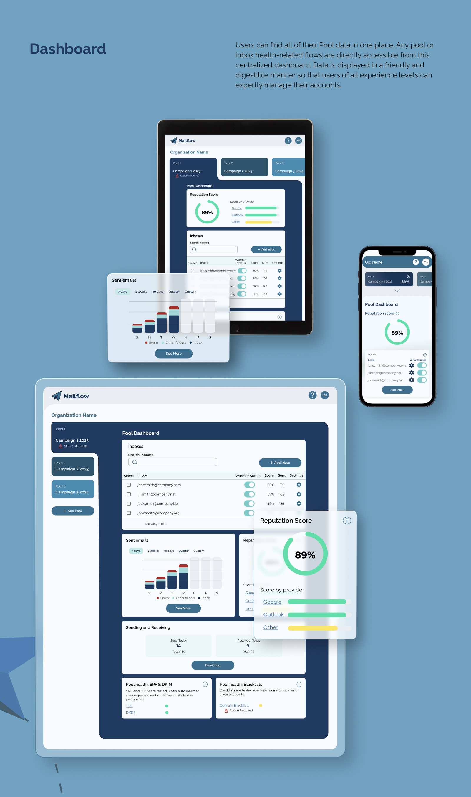
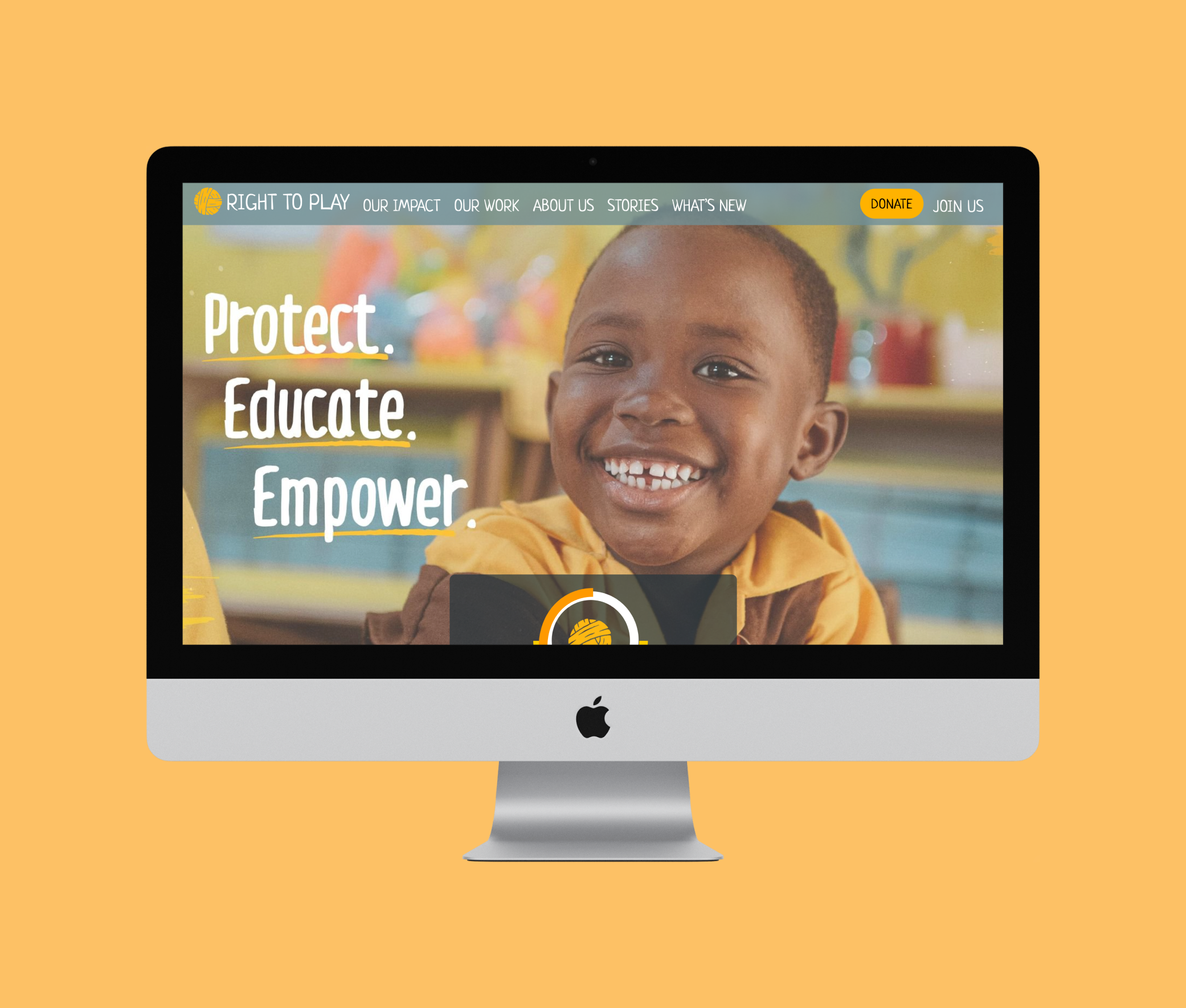
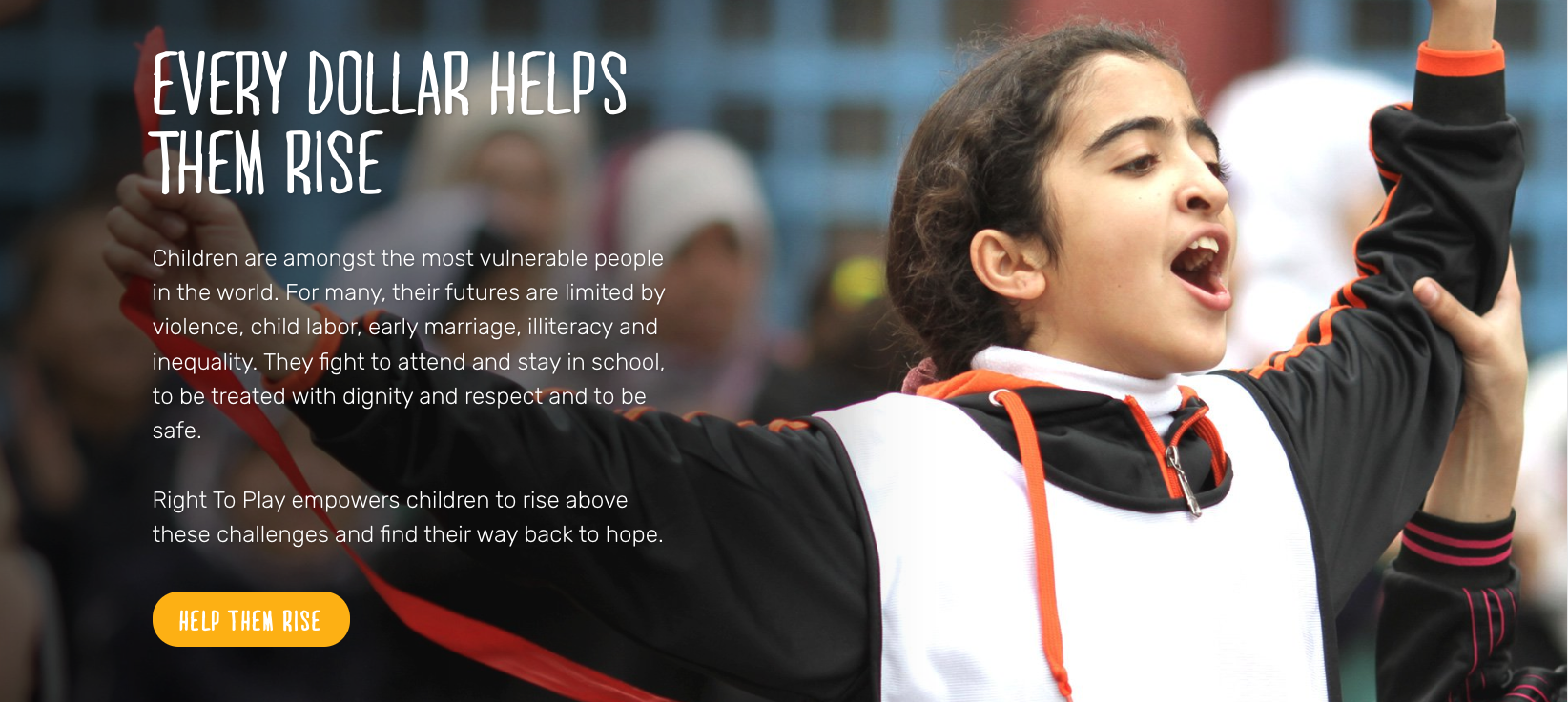
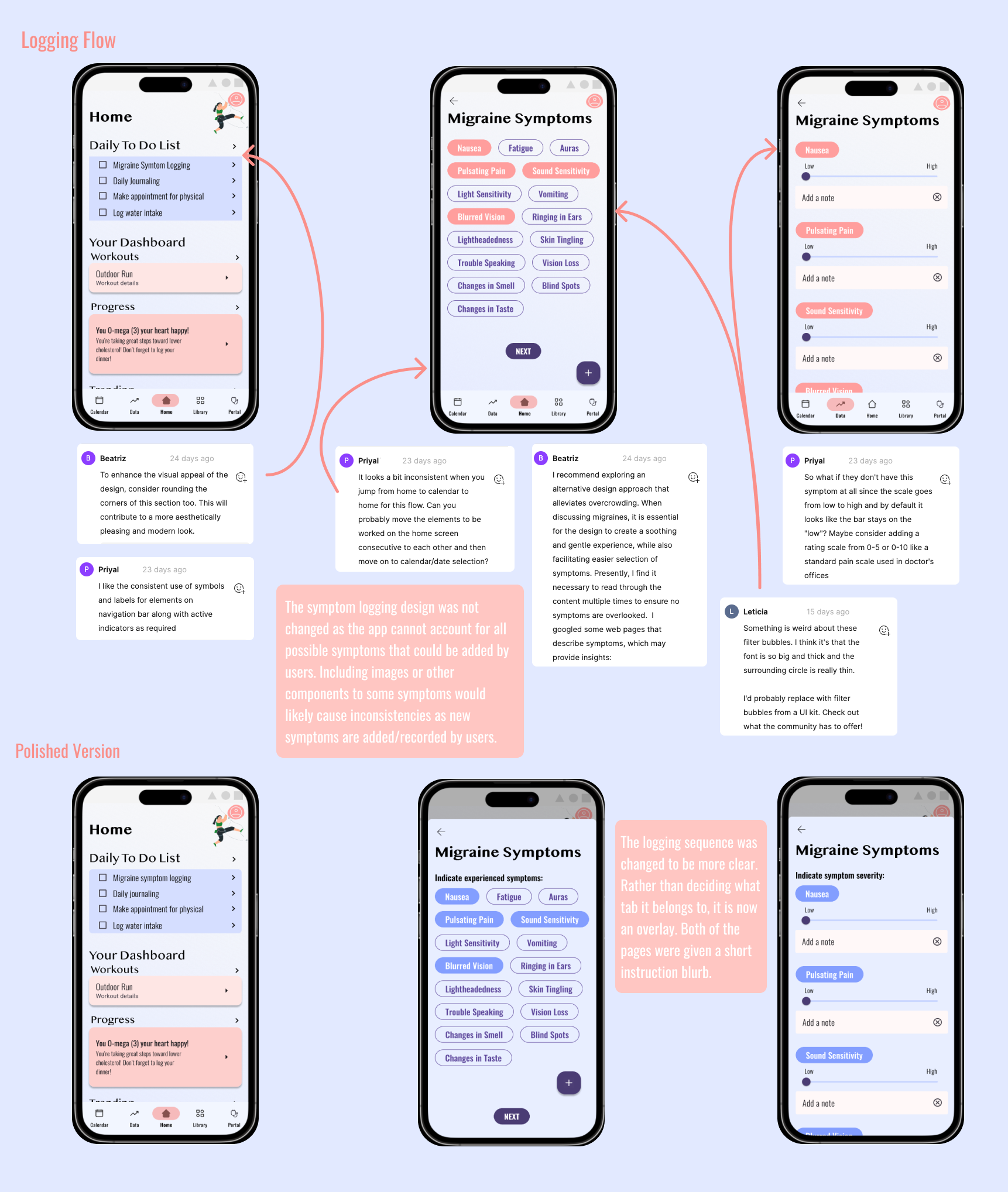
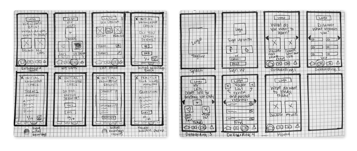
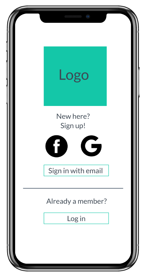
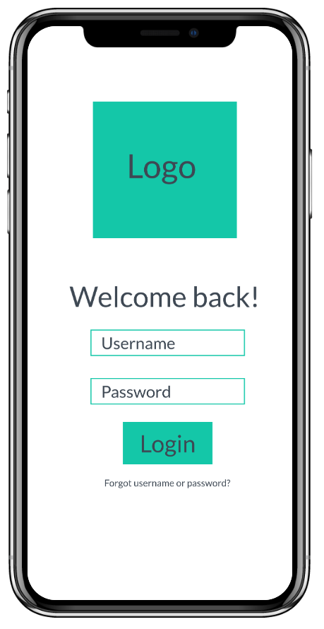
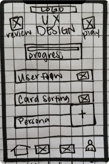
This three-week project was aimed at exploring and redesigning the NGO's homepage to improve accessibility, mission and NGO action visibility, and donation conversions in an ethical manner. I conducted a redesign as an exercise in ethics and accessibility-mindedness. This redesign expanded visibility and likelihood of conversion based on an accessibility audit, persona needs, and ethically conscious design decisions.
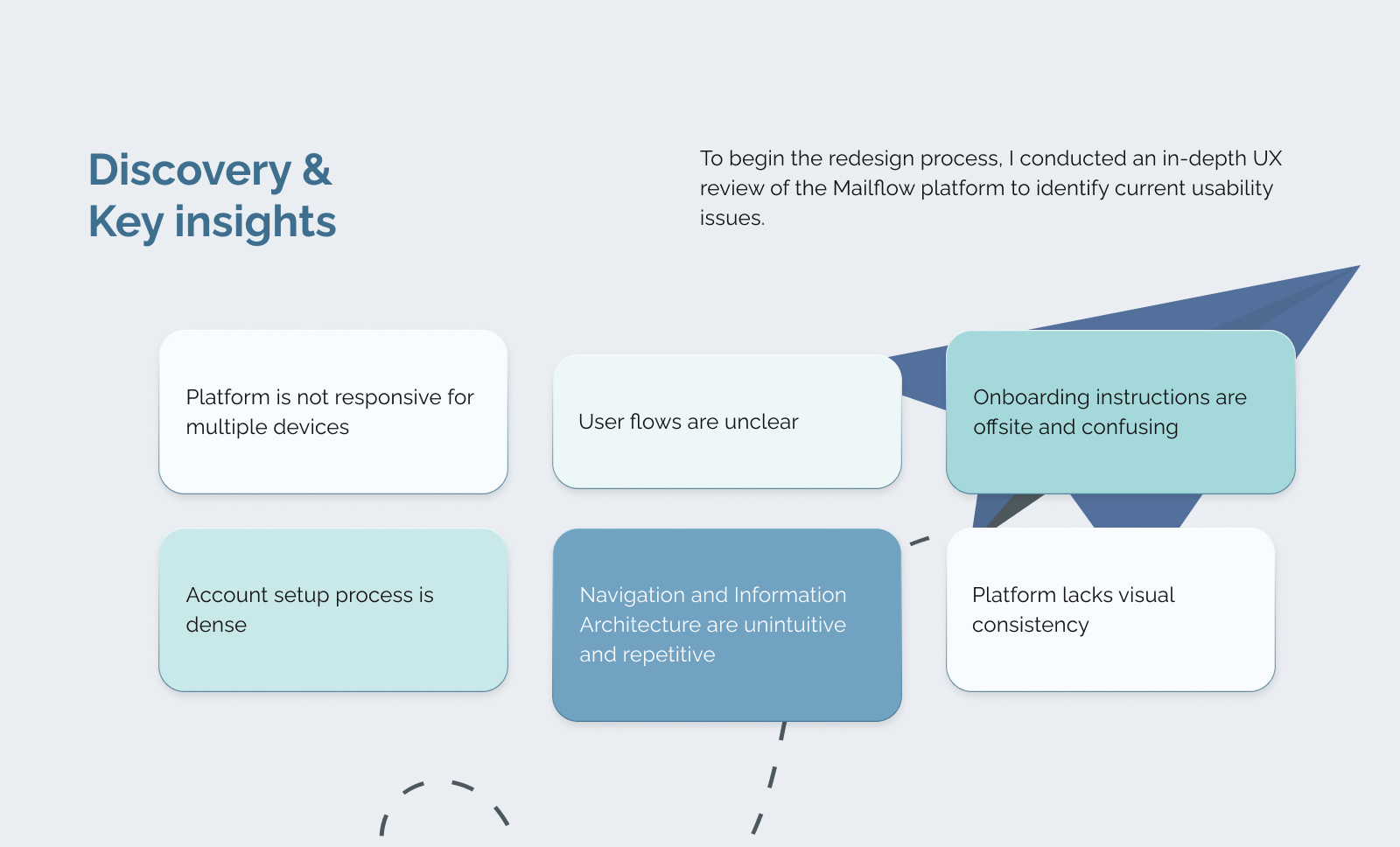
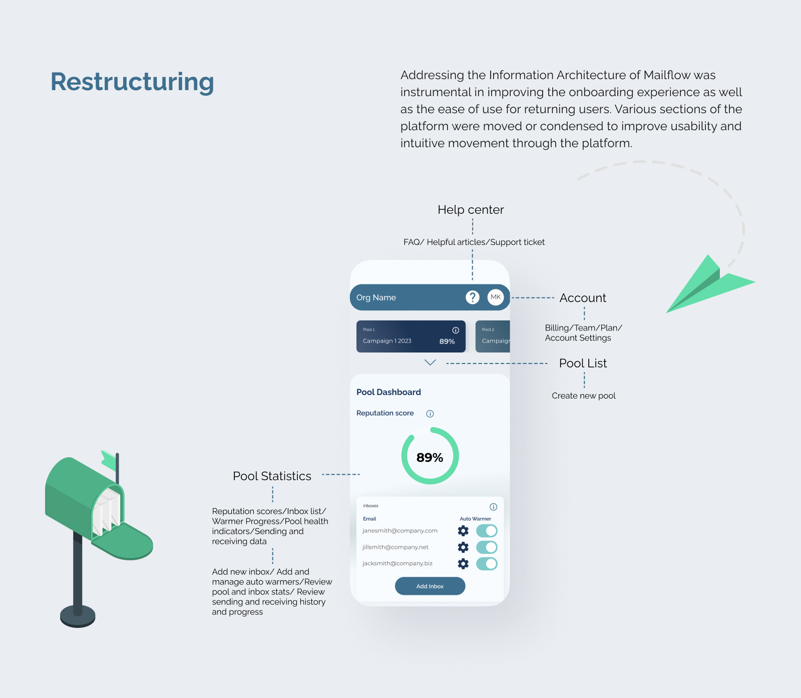
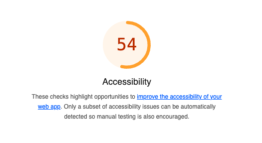
The A11Y Project checklist and Lighthouse for Chrome were used to identify usability issues such as appropriate color contrast, non-descriptive links, and more.
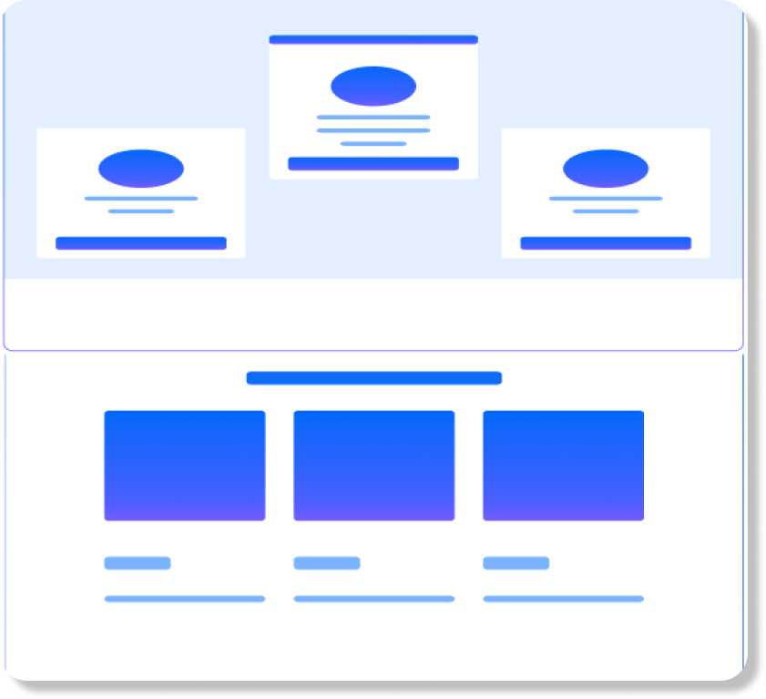
Front-end usability issues identified:
Back-end usability issues identified:
A Donation likelihood assessment was conducted to evaluate the visibility of opportunities to donate as well as information related to how donation dollars are used by the organization.
Donation visibility issues:
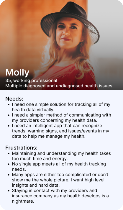
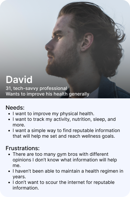
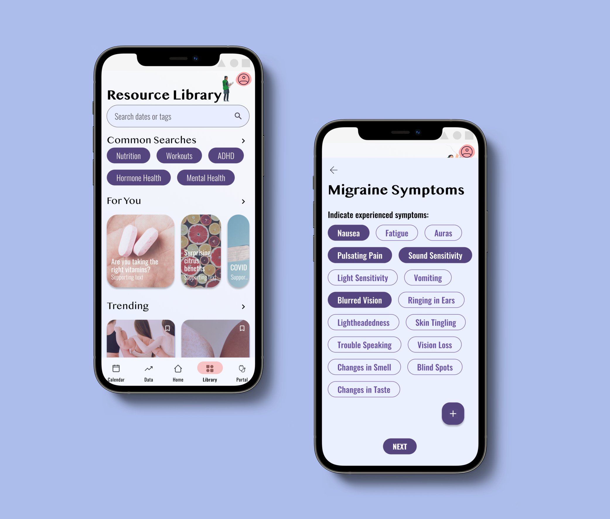
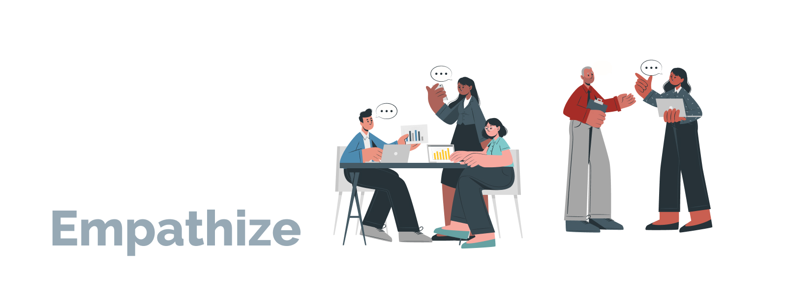
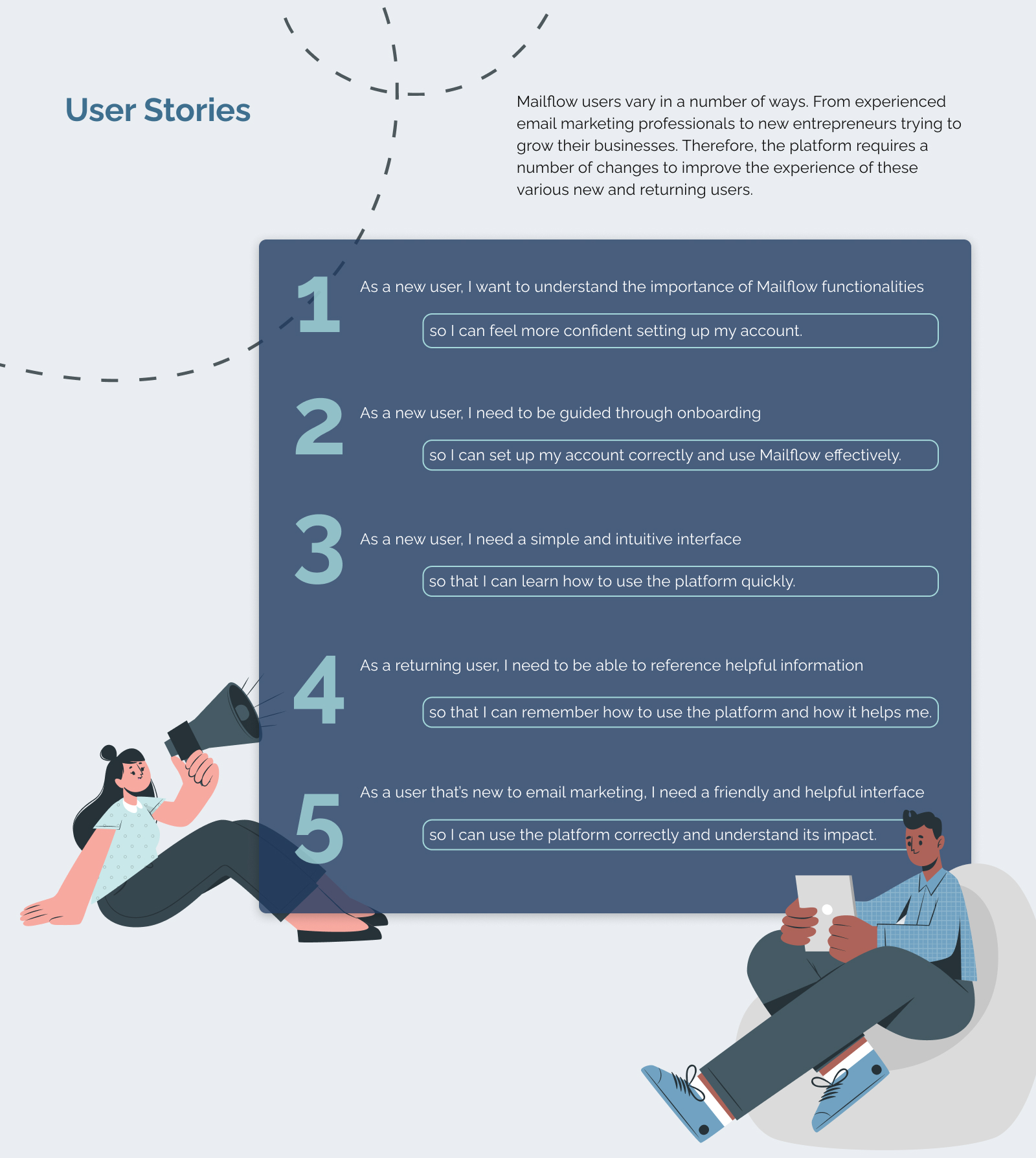
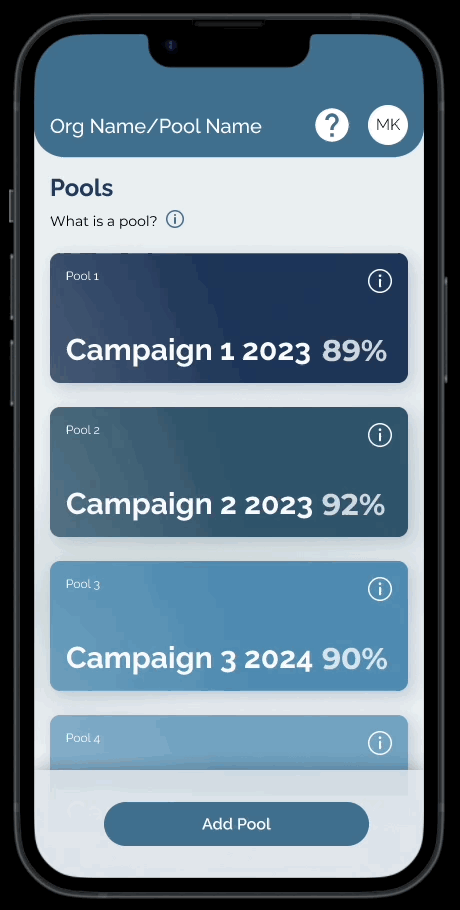
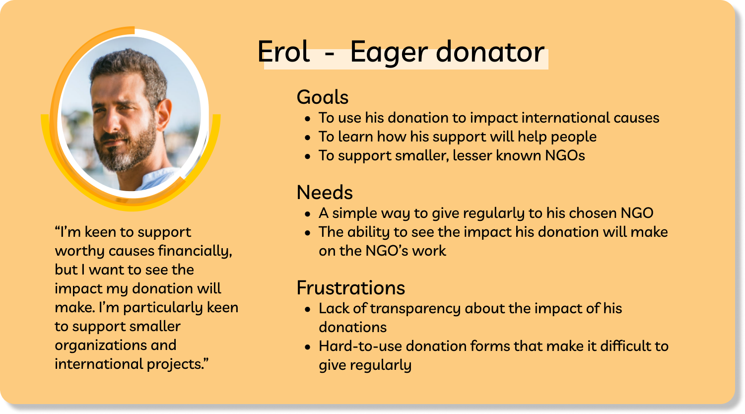
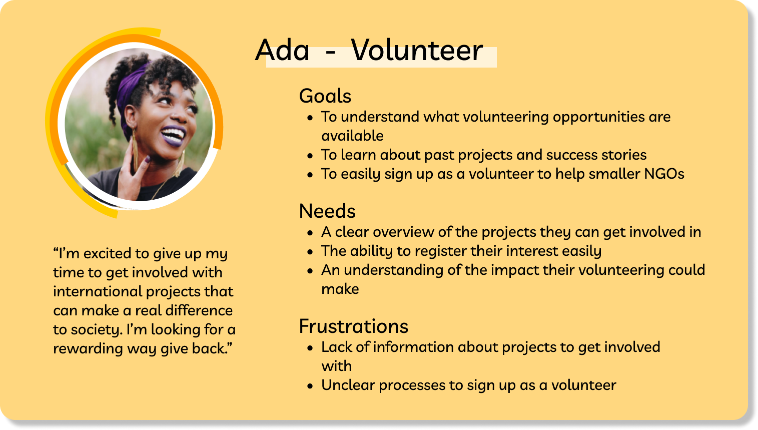
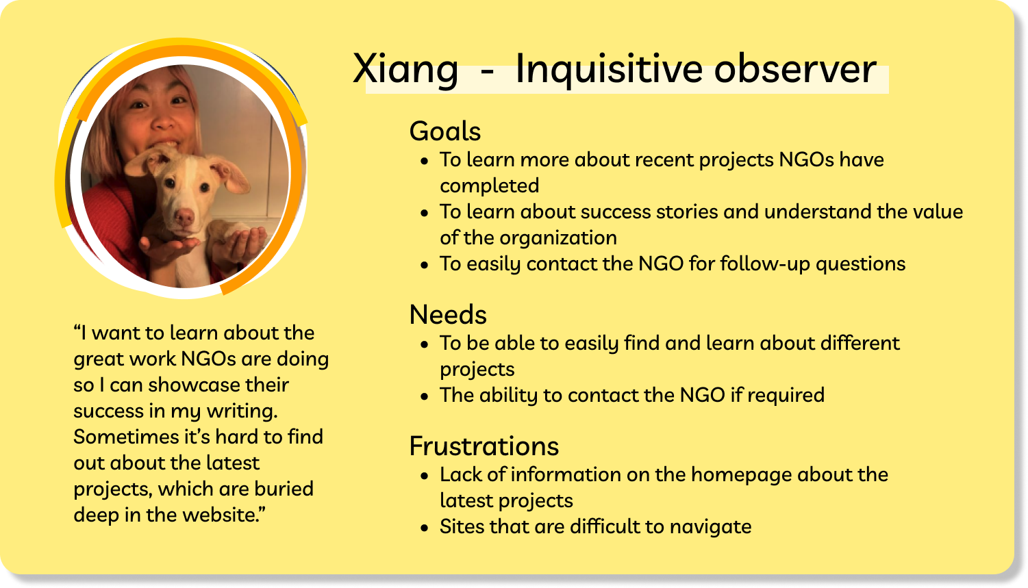
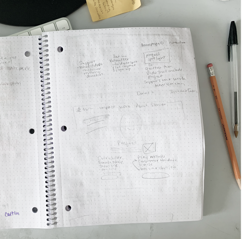
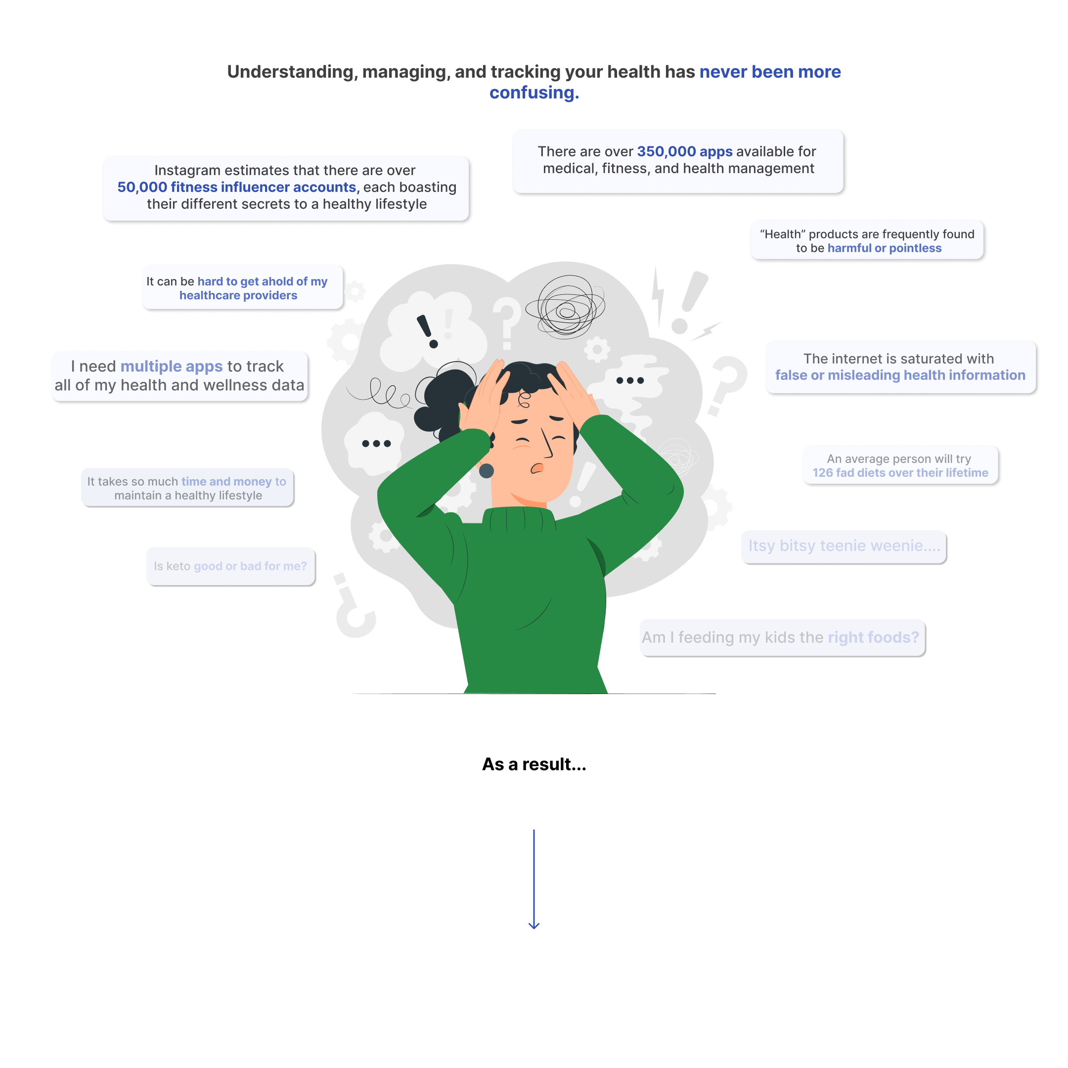
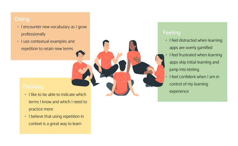
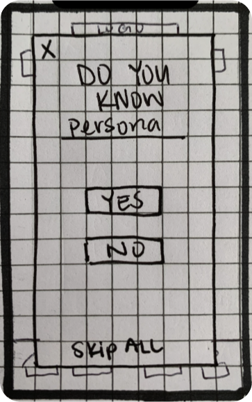
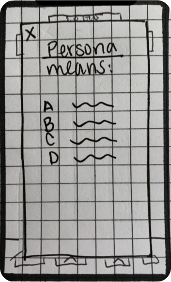
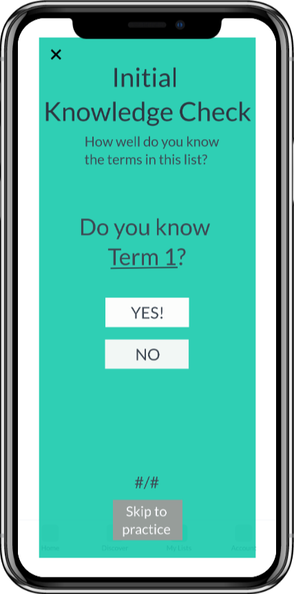
User research was conducted to create three user personas that may interact with the Right To Play website. These personas personify the goals for improving the homepage and guide decision-making.


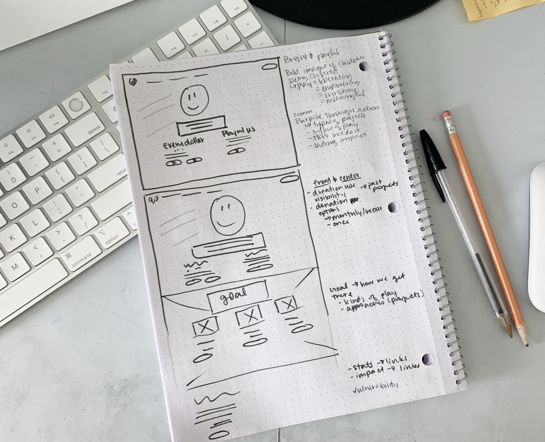
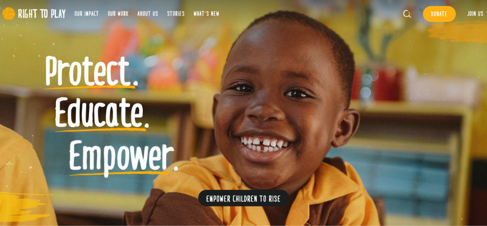
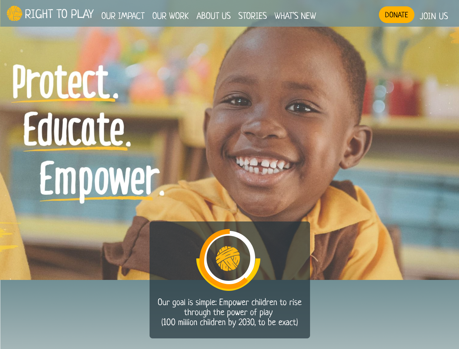
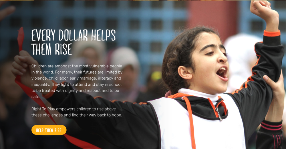
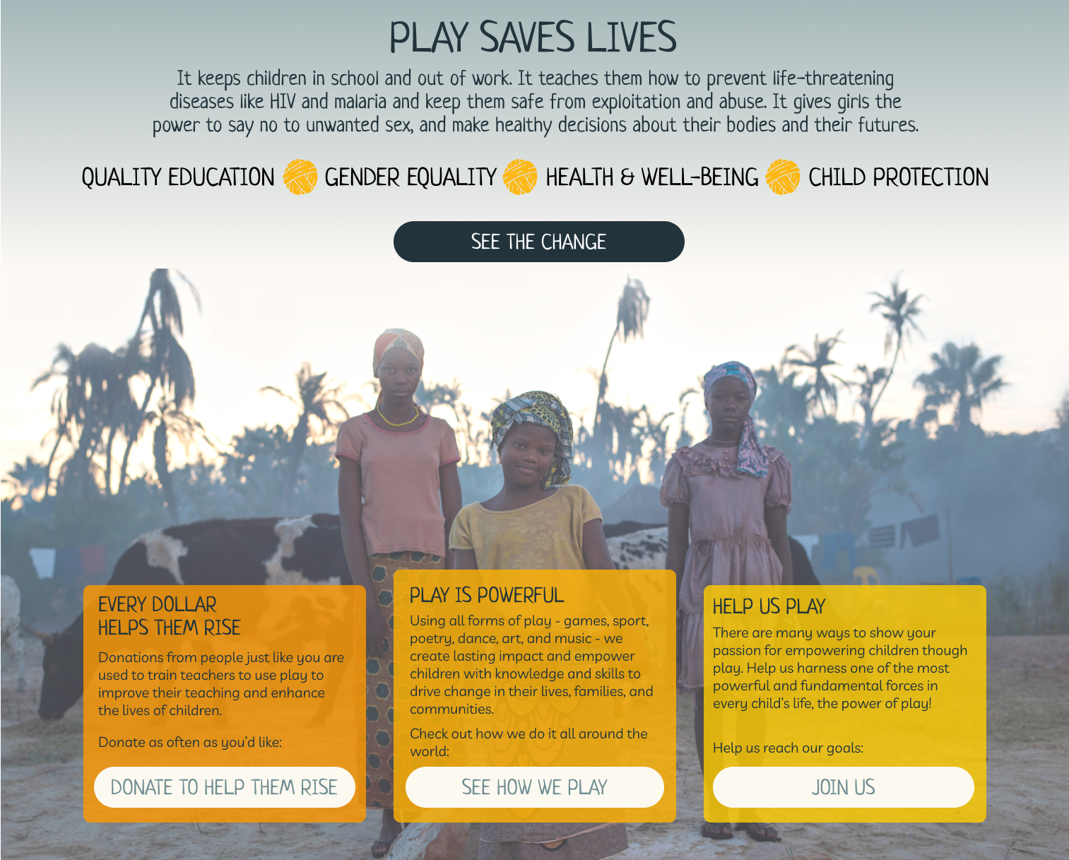
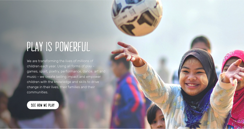
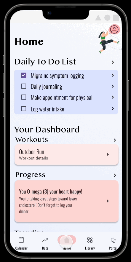
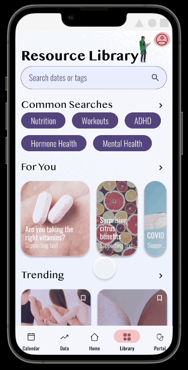
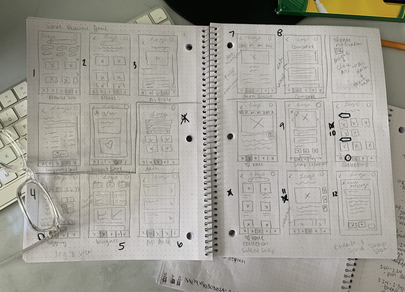
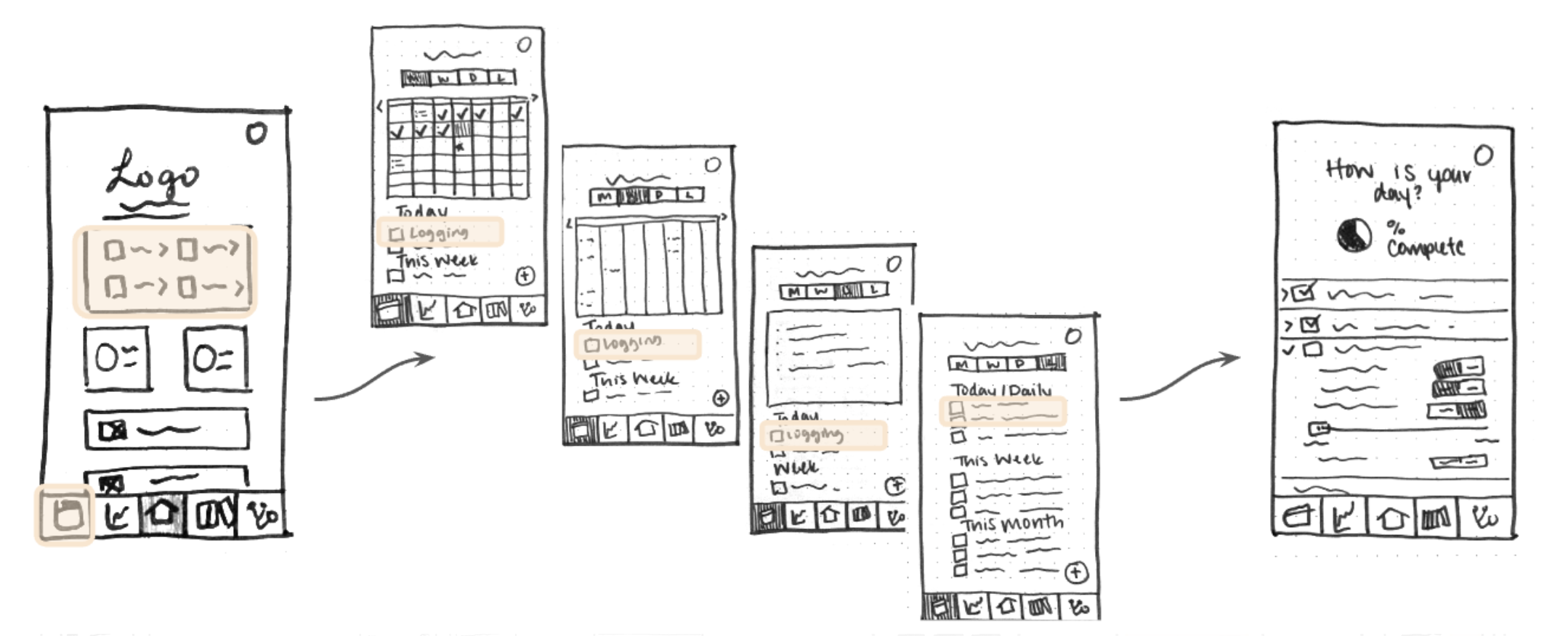
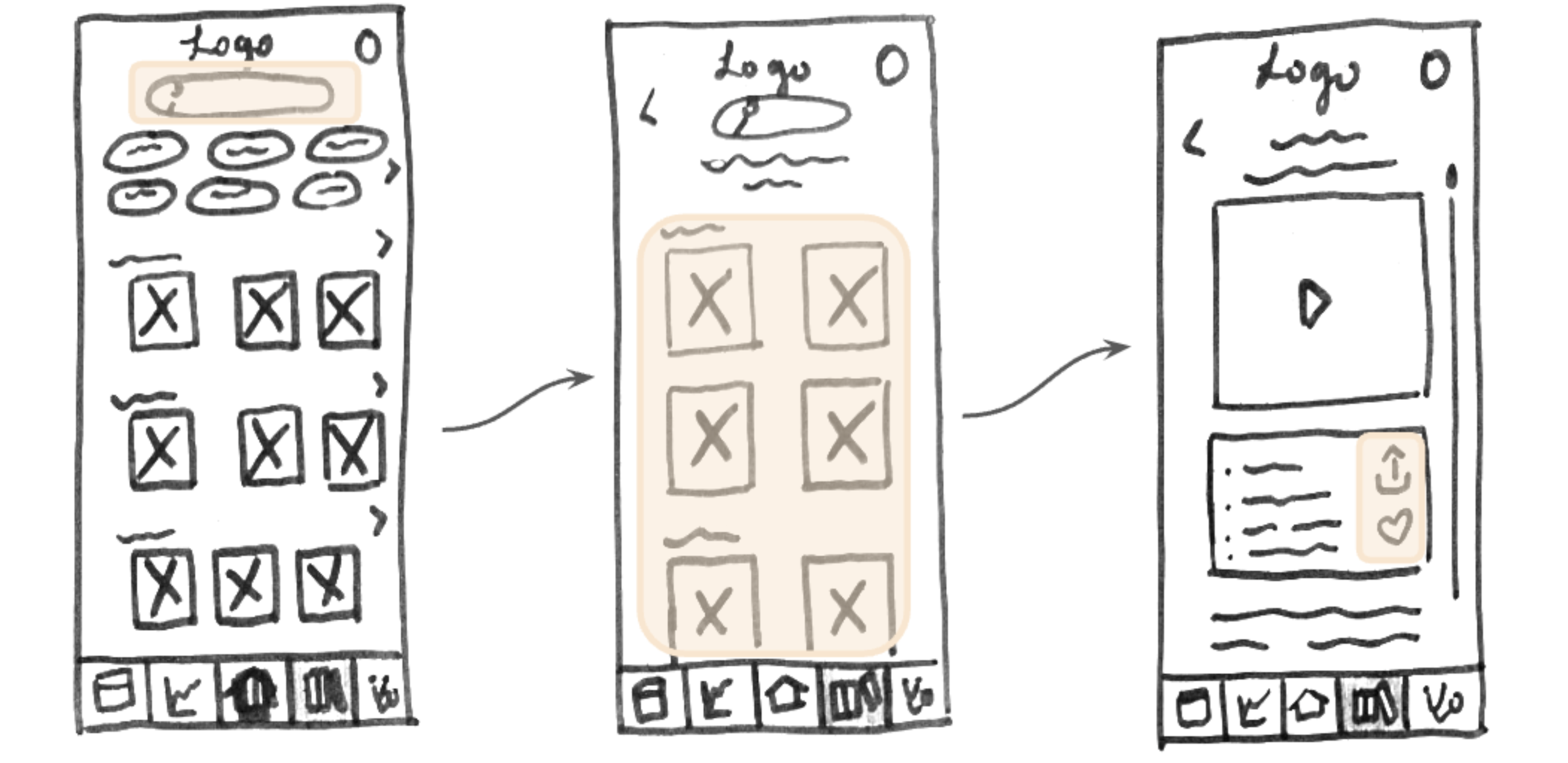
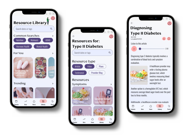
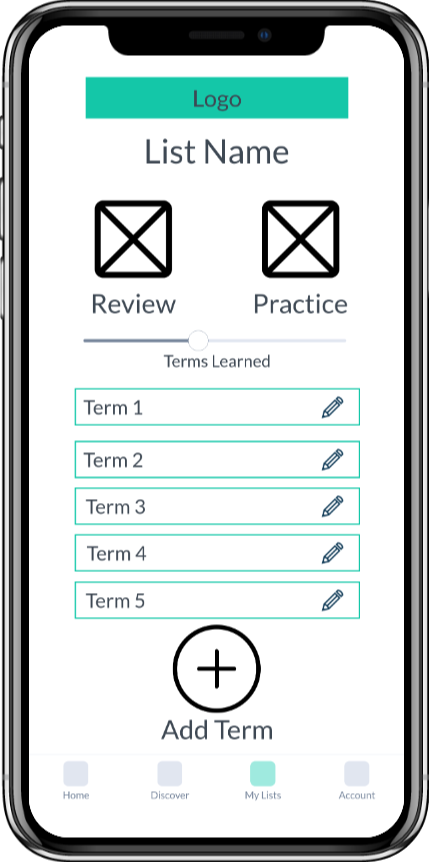
The redesign of the Right To Play homepage
I greatly enjoyed getting to know this nonprofit and ideating on how I could help spread their mission via their homepage. Thinking through a lens of accessibility and designing for good was a worthwhile exercise in centering my design practice. It renewed my appreciation for resources such as the Tarot Cards of Tech and Cards for Humanity that serve as reminders and litmus tests for true success in the work we do as designers.
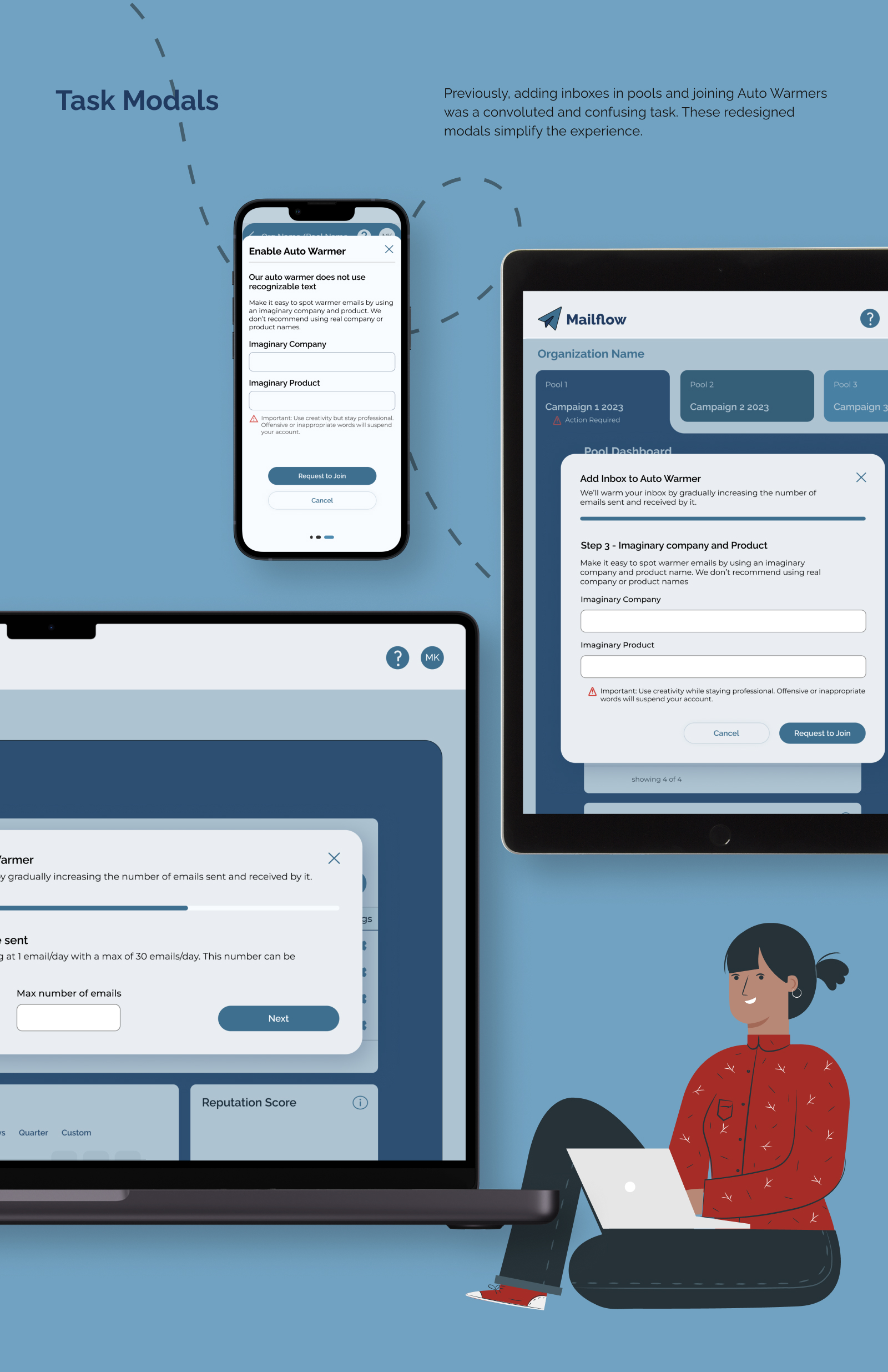
While I only tackled the homepage for this case study, this website could be further developed in a number of ways with respect to the goals of this project. Here are a few:
Delightful and fun animations could be thoughtfully included to convey the playful spirit of the organization and inspire their users.
One of the largest issues contributing to the site's poor accessibility score is the user's inability to zoom in on the page. Many individuals need this feature and preventing its use creates a barrier for interested users and possible supporters. Allowing users to zoom will greatly expand the possible reach of Right To Play's mission.
The inclusion of breadcrumbs would further improve the accessibility of the site. Many pages do not give the user clues as to where they are on the site or how they got there. For example, a persistent highlight of the relevant navigation tab would serve as a helpful reminder.
Right To Play is a nonprofit organization with a mission to protect, educate, and empower children to rise above adversity using the power of play. Their goal is to improve the lives of 100 million children around the world by 2030.
The have identified their homepage as needing improvement. The following stand between Right To Play and their goals:
This three-week project was aimed at exploring and redesigning the NGO's homepage to improve accessibility, mission and NGO action visibility, and donation conversions in an ethical manner. I conducted a redesign as an exercise in ethics and accessibility-mindedness. This redesign expanded visibility and likelihood of conversion based on an accessibility audit, persona needs, and ethically conscious design decisions.
The A11Y Project checklist and Lighthouse for Chrome were used to identify usability issues such as appropriate color contrast, non-descriptive links, and more.
Front-end usability issues identified:
Back-end usability issues identified:


A Donation likelihood assessment was conducted to evaluate the visibility of opportunities to donate as well as information related to how donation dollars are used by the organization.
Donation visibility issues:
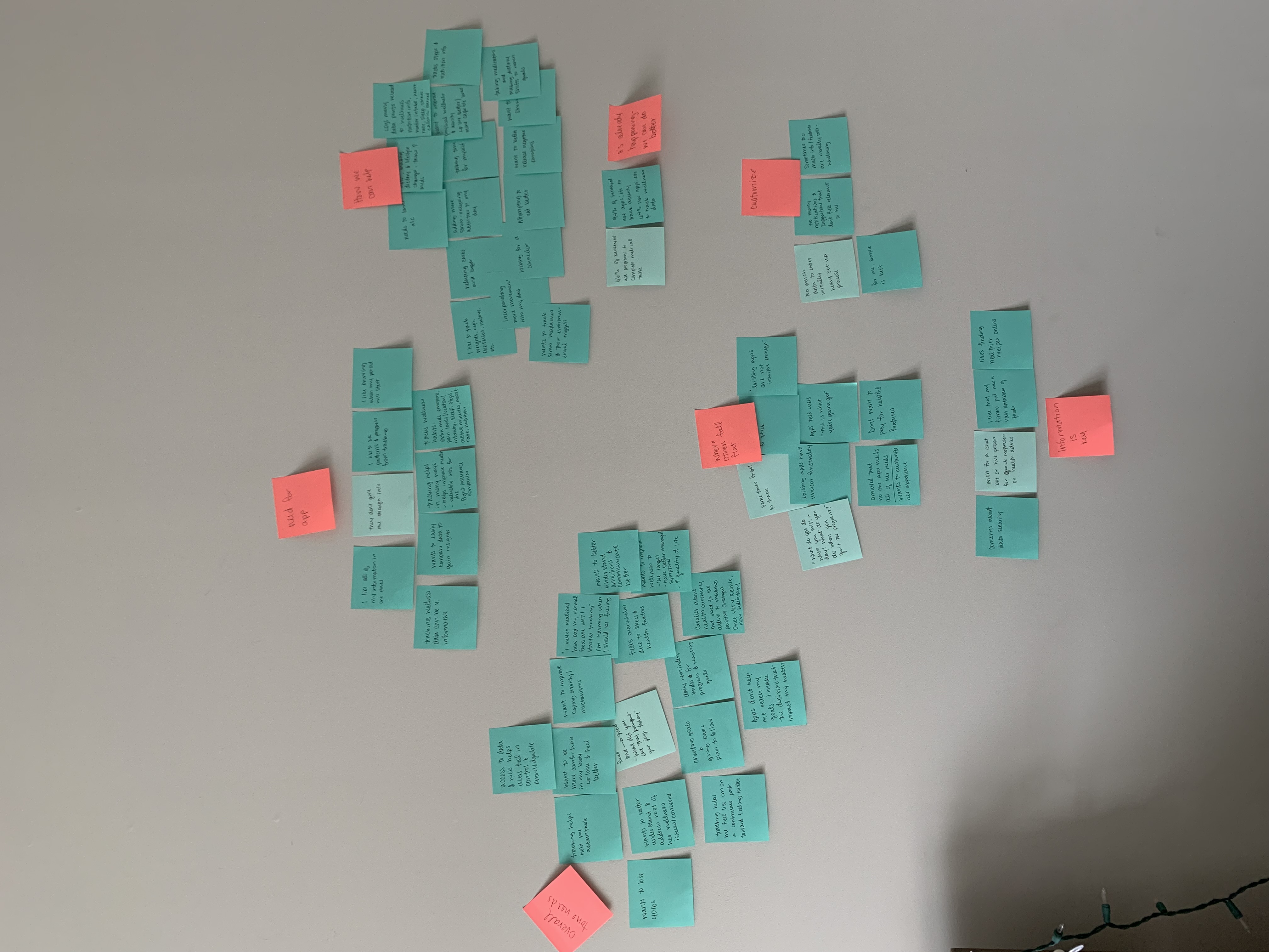
User research was conducted to create three user personas that may interact with the Right To Play website. These personas personify the goals for improving the homepage and guide decision-making.


.png)

 All design & feedback considerations
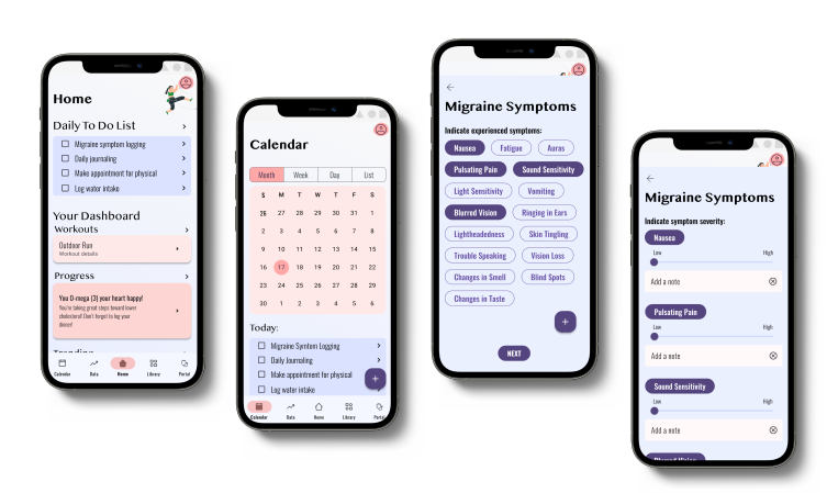
I greatly enjoyed getting to know this nonprofit and ideating on how I could help spread their mission via their homepage. Thinking through a lens of accessibility and designing for good was a worthwhile exercise in centering my design practice. It renewed my appreciation for resources such as the Tarot Cards of Tech and Cards for Humanity that serve as reminders and litmus tests for true success in the work we do as designers.
While I only tackled the homepage for this case study, this website could be further developed in a number of ways with respect to the goals of this project. Here are a few:
Delightful and fun animations could be thoughtfully included to convey the playful spirit of the organization and inspire their users.
One of the largest issues contributing to the site's poor accessibility score is the user's inability to zoom in on the page. Many individuals need this feature and preventing its use creates a barrier for interested users and possible supporters. Allowing users to zoom will greatly expand the possible reach of Right To Play's mission.
The inclusion of breadcrumbs would further improve the accessibility of the site. Many pages do not give the user clues as to where they are on the site or how they got there. For example, a persistent highlight of the relevant navigation tab would serve as a helpful reminder.
Right To Play is a nonprofit organization with a mission to protect, educate, and empower children to rise above adversity using the power of play. Their goal is to improve the lives of 100 million children around the world by 2030.
The have identified their homepage as needing improvement. The following stand between Right To Play and their goals:
This three-week project was aimed at exploring and redesigning the NGO's homepage to improve accessibility, mission and NGO action visibility, and donation conversions in an ethical manner. I conducted a redesign as an exercise in ethics and accessibility-mindedness. This redesign expanded visibility and likelihood of conversion based on an accessibility audit, persona needs, and ethically conscious design decisions.
The A11Y Project checklist and Lighthouse for Chrome were used to identify usability issues such as appropriate color contrast, non-descriptive links, and more.
Front-end usability issues identified:
Back-end usability issues identified:

A Donation likelihood assessment was conducted to evaluate the visibility of opportunities to donate as well as information related to how donation dollars are used by the organization.
Donation visibility issues:
 Interview script, notes, & summary
User research was conducted to create three user personas that may interact with the Right To Play website. These personas personify the goals for improving the homepage and guide decision-making.
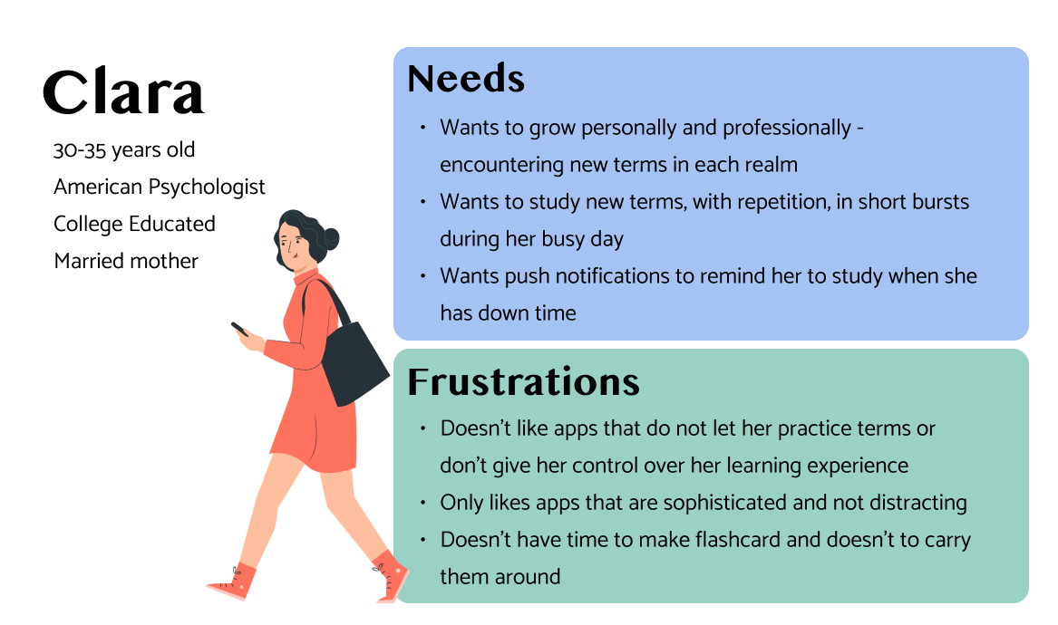 See full persona

.jpg)
I greatly enjoyed getting to know this nonprofit and ideating on how I could help spread their mission via their homepage. Thinking through a lens of accessibility and designing for good was a worthwhile exercise in centering my design practice. It renewed my appreciation for resources such as the Tarot Cards of Tech and Cards for Humanity that serve as reminders and litmus tests for true success in the work we do as designers.
While I only tackled the homepage for this case study, this website could be further developed in a number of ways with respect to the goals of this project. Here are a few:
Delightful and fun animations could be thoughtfully included to convey the playful spirit of the organization and inspire their users.
One of the largest issues contributing to the site's poor accessibility score is the user's inability to zoom in on the page. Many individuals need this feature and preventing its use creates a barrier for interested users and possible supporters. Allowing users to zoom will greatly expand the possible reach of Right To Play's mission.
The inclusion of breadcrumbs would further improve the accessibility of the site. Many pages do not give the user clues as to where they are on the site or how they got there. For example, a persistent highlight of the relevant navigation tab would serve as a helpful reminder.